Gallery
See what others have created
s1emens
@s1emens
Switch & Toggle
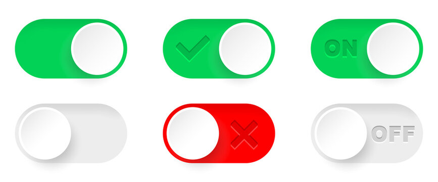
Design a binary switch component that can be dropped into a settings form. Show the full control: label, helper text if needed, track, thumb, and the current on/off state. The default state should read clearly before interaction, with one state visually primary and the other clearly inactive.
Show the switch in its key states: off, on, hover, focus, pressed, and disabled. The animation should be short and functional, with the thumb sliding and the track updating at the same time. If you include text inside or beside the control, it must update with the state and never fight the label for attention.
Design for real form use, not a standalone demo. The control should align cleanly with surrounding content, keep a comfortable tap target, and preserve clarity in high-contrast or reduced-motion contexts. If you add a toggle-style variant, make sure it follows the same state logic and reads as a binary choice at a glance.
What to deliver
- Design a switch control with on and off states.
- Show the label, current state, and thumb position in each state.
- Include hover, focus, pressed, and disabled states.
- Show a second toggle variant if the product needs binary choice in text form.
Use contrasting colors and clear labels to ensure the state of the switch is unmistakable at a glance. A playful click or slide sound effect can also elevate the tactile feel in the final interactive mockup.