Comment
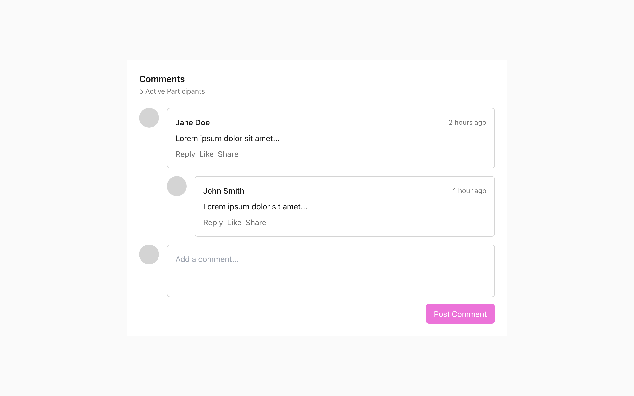
Design the comment component as a reusable social UI piece, not a full discussion page. Focus on the parts users touch most: writing a comment, reading a posted comment, and replying inline.
Start with a composer that includes an avatar slot, multiline text input, and a clear submit button. Show the empty state, typed state, and disabled state when submission is unavailable. If attachments or emoji are included, keep them secondary and compact so the text field stays the main focus.
Then design the posted comment state: author name, timestamp, comment text, and a small action row for reply, like, and more. Show one nested reply level so the hierarchy is easy to scan. The layout should work in a blog, course, or feed without changing the component’s structure.
Make the component feel calm and readable at small sizes. Text should carry the weight, actions should not crowd the content, and replies should remain visually connected to the parent comment.
Inspire engagement by adding a feature that highlights the number of active participants in the conversation.
Better at UI design with every challenge
Select complexity and generate challenge.
Pick a platform.
Get design challenge updates in your inbox
New prompts and challenge updates. It’s free.