Gallery
See what others have created
s1emens
@s1emens
Team Section
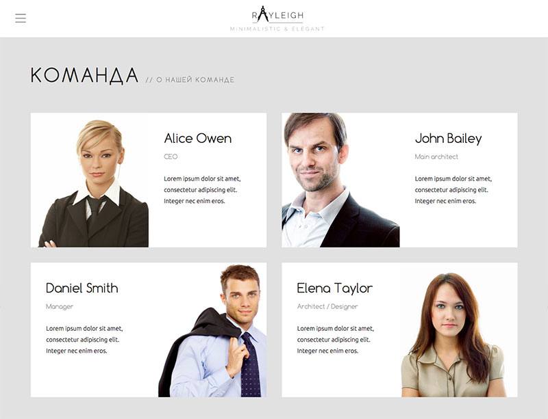
Design a team section that introduces the people behind the product or company. Show a set of 4–8 team members in a grid or row-based layout, with each card carrying the essentials: photo, name, title, and a short bio or specialty line. Keep the cards consistent so the section scans quickly, but leave room for one or two featured people if the layout needs hierarchy.
Add a clear secondary action on each card for a profile link, LinkedIn, or email. If you use hover or focus states, make them add value: surface the extra links, a longer bio, or a short fun fact. Core identity should never disappear behind interaction.
The section should work as a real page component, not a gallery. On smaller screens, the layout should stack cleanly or become a swipeable rail without losing readability. Keep the copy tight and the visual style aligned with the brand, so the team feels like part of the product story rather than a stock people grid.
What to deliver
- Design a team section with 4–8 member cards.
- Include photo, name, title, and one-line bio for each person.
- Add a secondary action for profile, LinkedIn, or email on hover/focus.
- Use a layout that works at desktop and collapses cleanly on smaller screens.
Incorporate unique design elements like animated avatars or fun facts that pop up on hover to make your team section stand out and memorable.