Gallery
See what others have created
manvishah
@manvishah
Thumbnail
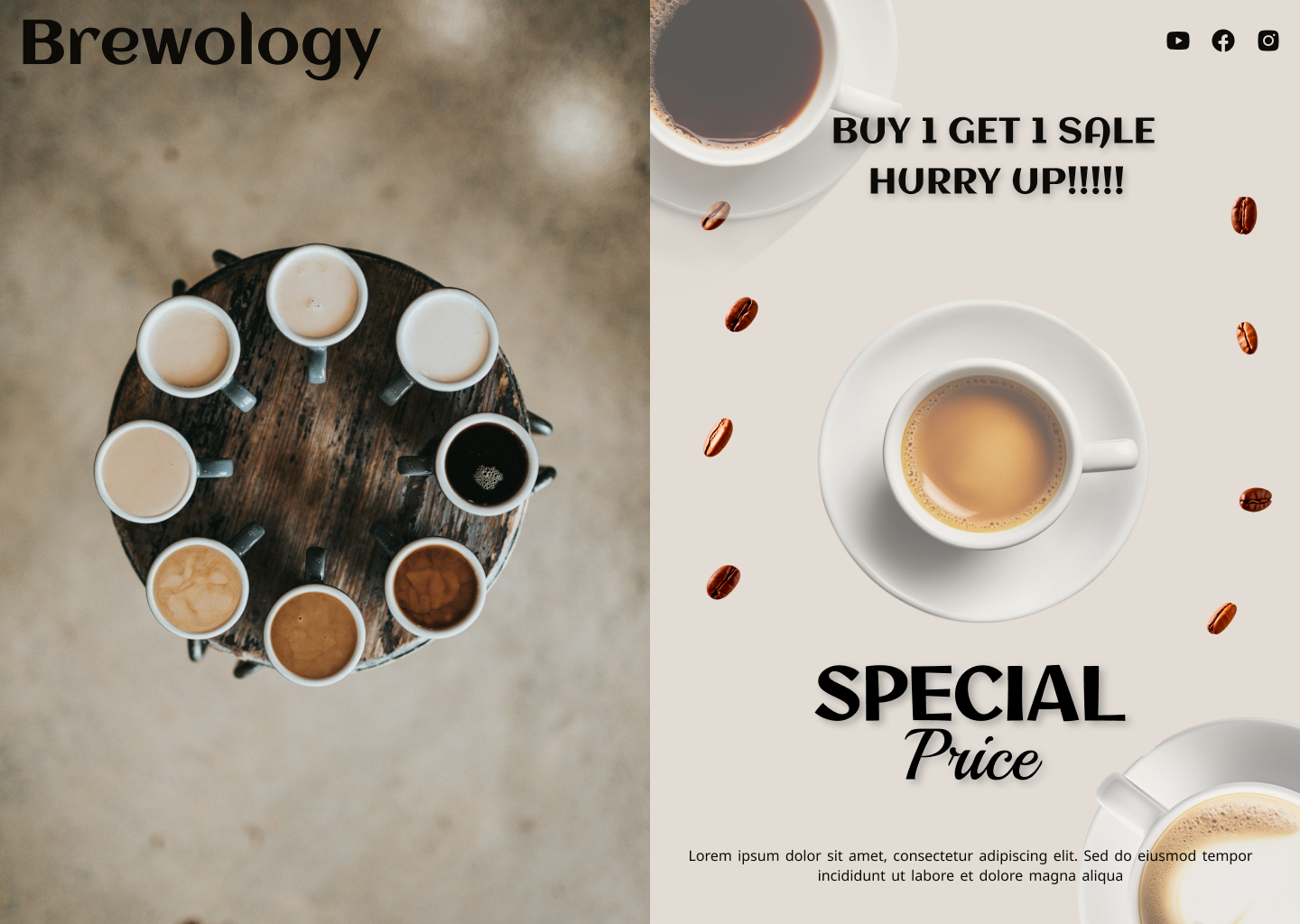
Design a thumbnail component for content cards such as videos, articles, or gallery items. Treat it as a compact preview that has to work at grid size, not a full poster. The image should do most of the work: pick one clear subject, crop it intentionally, and keep the frame readable even when reduced to a small tile.
Add a short title overlay or label only if it helps identification. Keep the type large, high-contrast, and placed where it does not fight the focal image. If branding is present, make it small and consistent, like a corner badge or channel mark.
Show the thumbnail in a normal state and at least one interaction state, such as hover or selected. The component should still read cleanly when multiple thumbnails sit side by side, with enough separation to scan quickly and enough detail to feel specific to the content.
What to deliver
- Design a 16:9 thumbnail at small-card size.
- Add a short title treatment that stays readable at low zoom.
- Use one focal image or illustration with clear subject matter.
- Include optional brand mark or channel label without crowding the frame.
- Show hover/selected state if the thumbnail is part of a grid.
Opt for clarity and intrigue in your thumbnail design; a harmonious blend can skyrocket click-through rates.