Gallery
See what others have created
dutifulremoval
@dutifulremoval
Info button
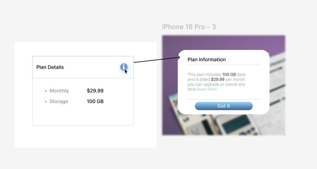
Design a small info button used to explain a field, label, or control in place. It should sit next to the thing it references and read as a secondary action, not a primary button. Use a familiar info icon, but make the hit area large enough to tap comfortably and the focus state obvious.
When activated, it should open a lightweight tooltip or popover with short contextual copy. Keep the panel close to the trigger, aligned so the user can connect the two without hunting. Include a clear dismiss pattern for pointer and keyboard users, and make sure the panel never covers the content it is explaining unless there is no other option.
Show the button inside a realistic form or settings screen so spacing, alignment, and hierarchy are clear. Include default, hover, focus, pressed, and open states, plus a version with longer explanatory text and one where the info content is unavailable. The component should feel calm, precise, and easy to ignore until needed.
What to deliver
- Design the info button in its default, hover, focus, and pressed states.
- Design the tooltip or popover it opens, including title, body copy, and close affordance.
- Place the component in a realistic UI context so spacing and alignment are clear.
- Show keyboard focus and an accessible trigger target.
- Include one long-content state and one empty or unavailable state.
Incorporate a universal 'i' symbol or question mark in the design to establish an immediate connect with users seeking information. Keep it snappy and fun!