Gallery
See what others have created
teesha001
@teesha001
Checkbox
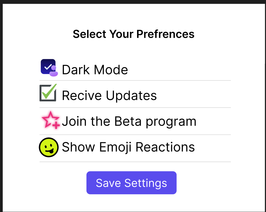
Design a checkbox component for form and settings use. Show the control as a compact row with a square box, label, and optional helper text. The row should feel easy to scan and easy to tap, with the whole label area acting as the target.
Include the full interaction set: unchecked, checked, indeterminate, hover, focus, and disabled. Show how the checkmark, fill, and border change in each state, and make sure the selected state reads clearly at small sizes.
Also show a checkbox group with multiple options, one required error state, and one partially selected parent item. Keep spacing consistent between items so the group still feels orderly when text wraps or validation appears.
What to deliver
- Design a checkbox control in unchecked, checked, hover, focus, and disabled states
- Show the label, hit area, and spacing rules for a single option row
- Include a grouped list of checkboxes with mixed selections
- Add helper text and error state for a required group
- Show the indeterminate state for parent-level selection
Inject fun into your checkbox design by customizing the appearance when active—think color changes, animations, or even playful tick marks!