Gallery
See what others have created
felixdesbiens
@felixdesbiens
Sidebar & Navigation Rail
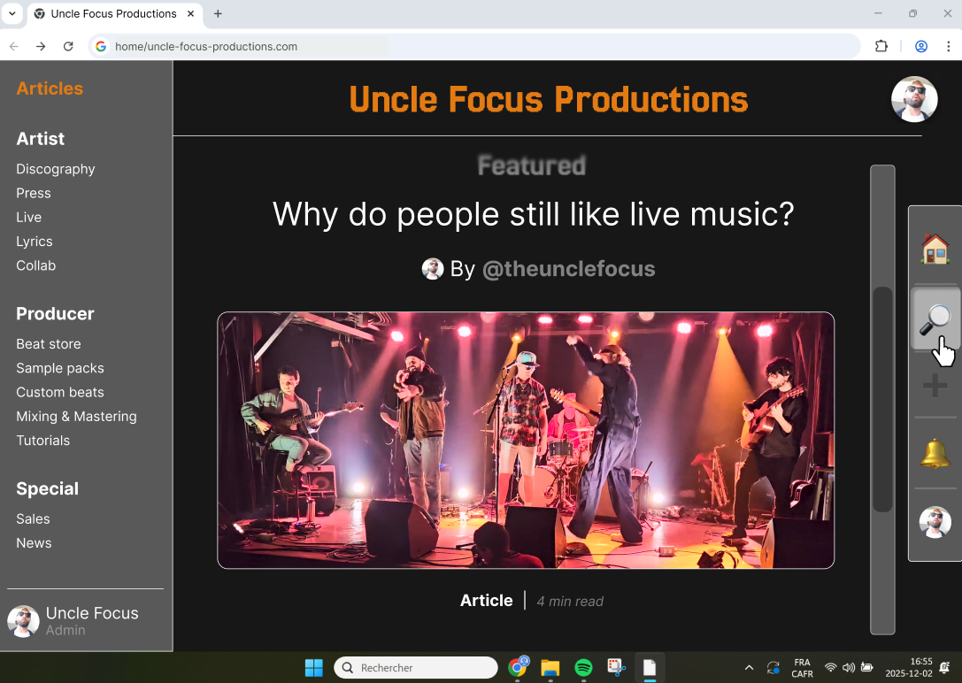
Design a sidebar and navigation rail for a desktop web app. The sidebar carries the main product navigation: top-level sections, nested items, and one clearly marked current page. The rail is the compact version for dense layouts, with icon-first destinations and a small set of always-available tools.
Show both expanded and collapsed states. In the expanded view, group related items, make section headers readable, and keep the current location obvious. In the collapsed view, preserve discoverability with tooltips or labels on hover and a clear active indicator so users can still tell where they are.
Include interaction states for expand/collapse, hover, focus, and disabled items. If the sidebar can be pinned, show the pinned and temporary overlay behavior. If a section contains many items, show how scrolling works without losing the active destination.
The layout should handle real navigation pressure: a long list of destinations, a few utility actions, and a clear hierarchy between primary nav and secondary tools. The result should feel fast to scan, easy to operate with keyboard and mouse, and stable as users move between sections.
What to deliver
- Design the expanded sidebar with primary sections, secondary links, and clear grouping.
- Design the compact navigation rail with icon-only destinations and tool shortcuts.
- Show expand/collapse behavior for sections and the full sidebar.
- Mark the active destination, hover, and keyboard focus states.
- Include a collapsed-to-expanded transition and a pinned/unpinned state.
Utilize color contrast and icons to make the sidebar and navigation rail both visually appealing and functional.