Gallery
See what others have created
unpublishedhanging
@unpublishedhanging
Skeleton
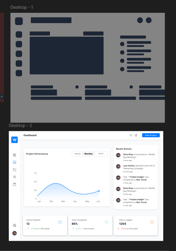
Design the loading skeleton for a content-heavy interface: a card, table row, or detail panel that is waiting for data. The layout should mirror the final screen, with gray placeholders in the same positions as headings, body text, avatars, thumbnails, and key values.
Treat this as a real in-between state, not decoration. The skeleton should communicate structure, preserve spacing, and reduce layout shift when content arrives. Keep the shapes simple and consistent with the component they stand in for.
Use placeholder blocks that vary in width and height to match the rhythm of the eventual content. If the real UI has actions, show muted button-shaped placeholders too. If there is a list or table, repeat the pattern cleanly so the user can scan what is loading and where.
What to deliver
- Design a loading skeleton for a content card or page section
- Use blocks that match the final layout’s text, media, and metadata positions
- Show a clear loading state without relying on spinner-only feedback
- Include a shimmer or pulse treatment and a static fallback
- Keep spacing and hierarchy aligned to the real content
Incorporate subtle hints or easter eggs related to anatomy or archaeology to engage users and add a playful touch to your skeleton design.