Gallery
See what others have created
unpublishedhanging
@unpublishedhanging
Color wells
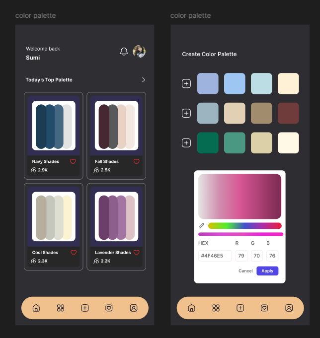
Design the color wells component for a design tool or settings panel. A color well should show the current color, a clear selected state, and a label or token name when space allows. Treat the wells as editable controls, not just swatches.
Build the component in a grid or row layout with multiple wells, plus a primary empty state for adding a new color. Include hover, focus, selected, disabled, and error states. If a well is selected, expose an inline editor nearby with hex input, opacity, and a picker trigger.
The editor should keep the current color visible while changes are made, and it should be clear which well is being edited. Add actions for duplicate, remove, and reset where they make sense. If the value is invalid, show the error next to the field and keep the previous valid color in view.
What to deliver
- Design a grid of color wells with labels, swatches, and selection states.
- Add hover, focus, active, and disabled states for each well.
- Show how a user edits a selected well with direct input and a color picker.
- Include add, duplicate, and remove actions for wells.
- Provide an error state for invalid color values.
Breath life into the mockup by showcasing a variety of colors in the wells. Think of them as a vibrant, inviting artist's palette that encourages creativity.