Gallery
See what others have created
unpublishedhanging
@unpublishedhanging
Pop-up buttons
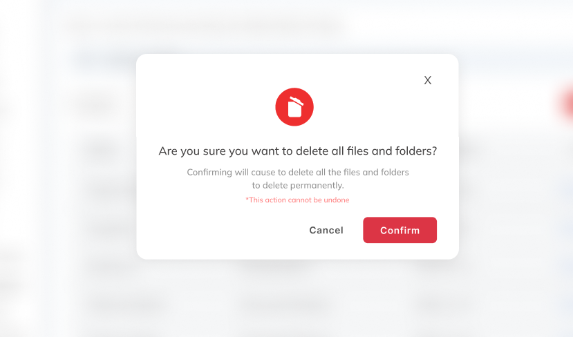
Design a pop-up button pattern for a product surface where a user either clicks a specific element or reaches a timed moment. The interaction should feel intentional, not surprising. Show what the trigger looks like before activation, then what appears after the popup opens.
The popup needs a clear hierarchy: short title, one or two lines of supporting copy, one primary action button, and one secondary way out. The primary button should be the visual anchor. The dismiss action can be a text button or close icon, but it should be easy to find without pulling attention away from the main action.
Treat this as a component system, not a single screen. Include open, hover, focus, and disabled states for the button, plus the popup’s open state and a clean dismissal state. Keep the popup compact enough to preserve page context, and make the timing or trigger behavior understandable from the UI itself.
What to deliver
- Design the trigger state for the popup button.
- Design the popup container with title, body copy, and one primary button.
- Add a secondary dismiss action and a close icon.
- Show the open, hover, focus, and disabled states for the button.
- Include a timed-appearance and click-trigger variant if relevant.
Strive for balance in your popup design; it should attract attention without being intrusive.