Gallery
See what others have created
unpublishedhanging
@unpublishedhanging
Action Option
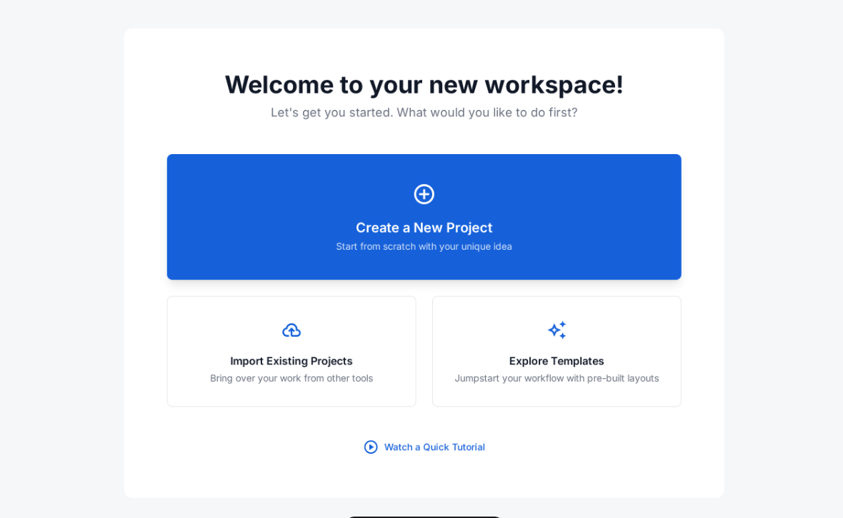
Design a decision component that helps a user choose one action from a short list. Treat it as a reusable screen element that could sit inside a workflow, settings page, or task panel. The user should be able to scan the options, understand the tradeoffs, and commit without hunting for more context.
Make the hierarchy explicit: one option should read as the default or recommended path, while the rest sit below it as alternatives. Each option needs a clear label, short supporting text, and a visible affordance for selection. If an option is unavailable, explain why instead of simply hiding it.
Include the full interaction set: idle, hover, selected, disabled, loading, and confirmed. After selection, keep the chosen value visible and show the next step or outcome in the same area. The component should still feel clear in a dense layout and should not rely on color alone to signal priority or state.
What to deliver
- Design a choice panel with one primary action and 2–4 secondary options.
- Show selected, hover, disabled, and unavailable states for each option.
- Include a confirmation or next-step state after the user commits.
- Make the component work in both compact and expanded layouts.
Incorporate visual cues like color contrast or icons to intuitively guide users towards making an action decision.