Gallery
See what others have created
arfipram_design
@arfipram_design
Tab group
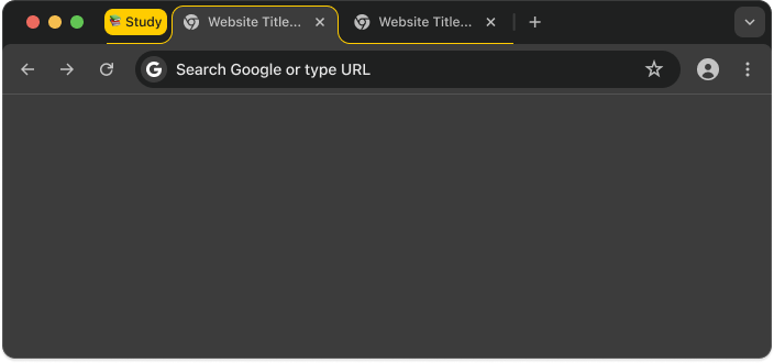
Design a tab group component for a browser-style interface. The group should help users sort open tabs by topic, project, or priority without losing track of what is active.
Show the group in its default state with a label, color cue, and tab count. Make it clear how grouped tabs differ from ungrouped tabs, and how the active tab is indicated inside the group.
Design the key interactions: create a group, rename it, add tabs to it, move tabs between groups, collapse and expand the group, and remove the group. If the group is collapsed, it should still communicate name, color, and number of tabs.
Handle long names, many tabs, and partial overflow. The component should stay readable when several groups sit next to each other and when the user needs to target one tab quickly.
What to deliver
- Design the default tab group chip with title, color, and tab count
- Show grouped tabs with a clear visual boundary and active-tab treatment
- Design create, rename, add-tab, move-tab, and remove-group interactions
- Include collapsed and expanded group states
- Add overflow handling for long labels and many tabs
Incorporate tooltip descriptions for tab group labels and icons to enhance user understanding without cluttering the visual space.