Gallery
See what others have created
vlxtupp
@vlxtupp
Stacked List
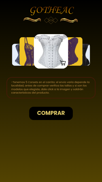
Design a stacked list component where several items are partially visible behind the active row. Treat it as a reusable UI pattern, not a decorative pile: the user should immediately understand what is selected, what is next, and how many items are in the stack.
Use a clear depth system to separate items. Offset each layer just enough to expose the title or key line of the cards behind it. Keep the front item dominant, with the next items fading back through scale, elevation, or contrast — but avoid effects that make the stack feel noisy or hard to scan.
Show at least three states: collapsed stack, one item expanded, and a transition state where the next item is partially revealed. If the component supports interaction, make the gesture obvious in the design itself: a handle, chevron, swipe affordance, or tap target that signals how the stack opens.
What to deliver
- Design a stacked list with 3–5 visible items and one active item in front.
- Show collapsed, expanded, and partially revealed item states.
- Define the spacing, overlap, and depth treatment between layers.
- Add one interaction pattern for revealing the next item: tap, drag, or swipe.
- Include a compact header or label that explains the stack count or grouping.
Incorporate motion design for expanding items to engage users and enhance the visual hierarchy.