Gallery
See what others have created
availablefootbridge
@availablefootbridge
Combo box
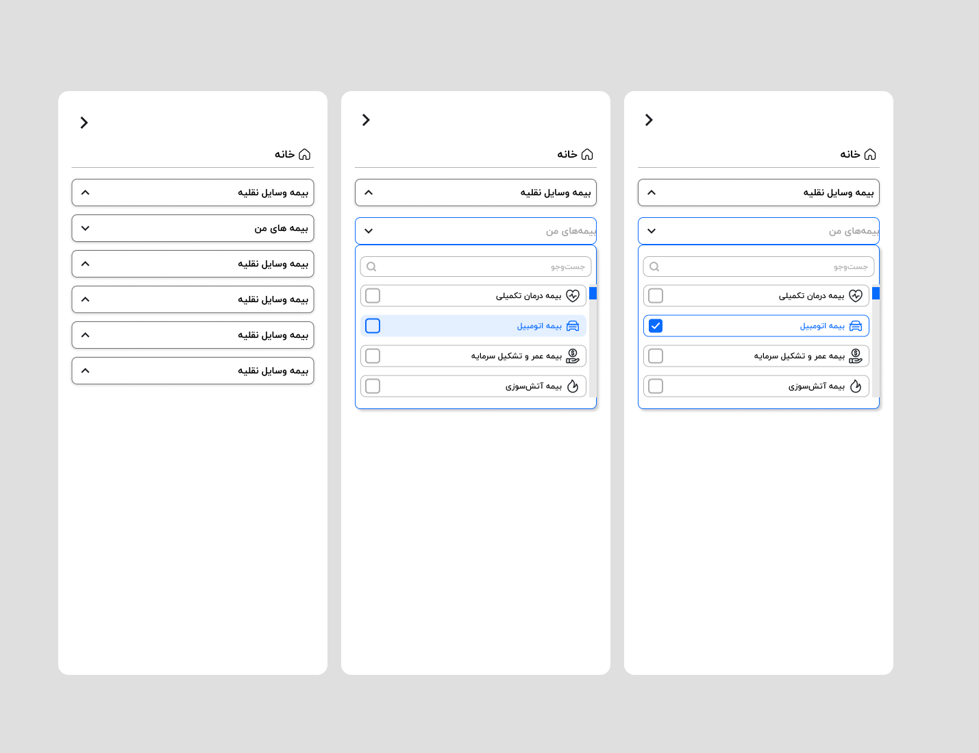
Design a combo box for a form field that supports both direct text entry and picking from a list. The closed state should show a label, editable field, placeholder or current value, and a clear affordance for opening the menu.
When the field opens, show a list anchored to the input with enough rows to demonstrate scrolling, selection, hover, and focus. Include a search pattern inside the dropdown if the list is long, and make the current selection obvious without relying on color alone.
Show the key interaction states: empty, filled, open, filtered, no results, disabled, and error. The component should read as one control, not a text field with a disconnected menu. Keyboard behavior should be visible in the design, including arrow navigation, enter to select, escape to close, and tab to move on.
What to deliver
- Design the closed input state with label, placeholder, and affordance.
- Design the expanded menu with option rows, hover, focus, and selected states.
- Include keyboard navigation and typeahead behavior.
- Show search/filter inside the open menu when the option set is long.
- Add empty, no-match, and disabled states.
For a playful touch, consider custom illustrations or unique typography for the list items in your combo box to inject personality into the design.