Gallery
See what others have created
felixdesbiens
@felixdesbiens
Toolbar
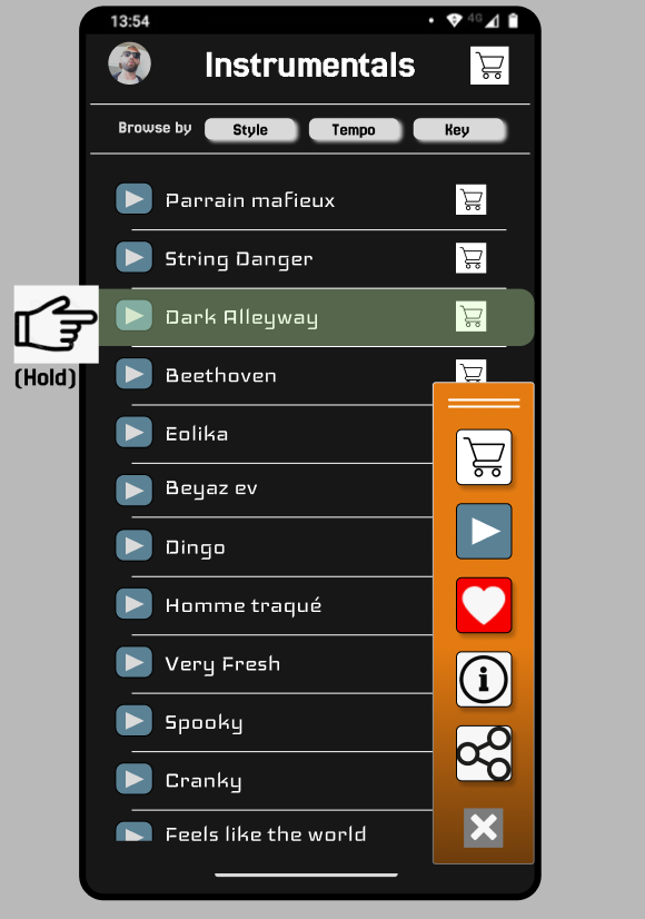
Design a contextual toolbar for a work app, not a decorative strip of icons. It should support a small set of frequent actions, one grouped control, and at least one action that moves into overflow when space gets tight. Pick a real placement: top bar above a canvas, side rail beside a document, or bottom bar in a mobile editor.
Make the toolbar readable at a glance. Use clear visual hierarchy so the primary action stands out, secondary actions stay quieter, and disabled tools still look intentional. Include icon-only and icon+label variants where that helps the layout, plus a dropdown or split-button for a tool with multiple modes.
Show interaction states for hover, pressed, active, focus, and disabled. If one tool is currently selected, it should remain obvious after the cursor moves away. The toolbar should hold up at different widths without breaking spacing, and keyboard navigation should feel direct, with focus moving in a predictable order.
What to deliver
- Design a contextual toolbar with 6–10 actions
- Include icon-only, icon+label, and overflow menu patterns
- Show active, hover, pressed, and disabled states
- Add a dropdown or segmented control for one tool group
- Place the toolbar in one realistic app layout
Incorporate customizable features or a 'favorites' section in the toolbar to allow users to tailor the experience to their workflow.