Gallery
See what others have created
infirmpatriot
@infirmpatriot
Confirmation
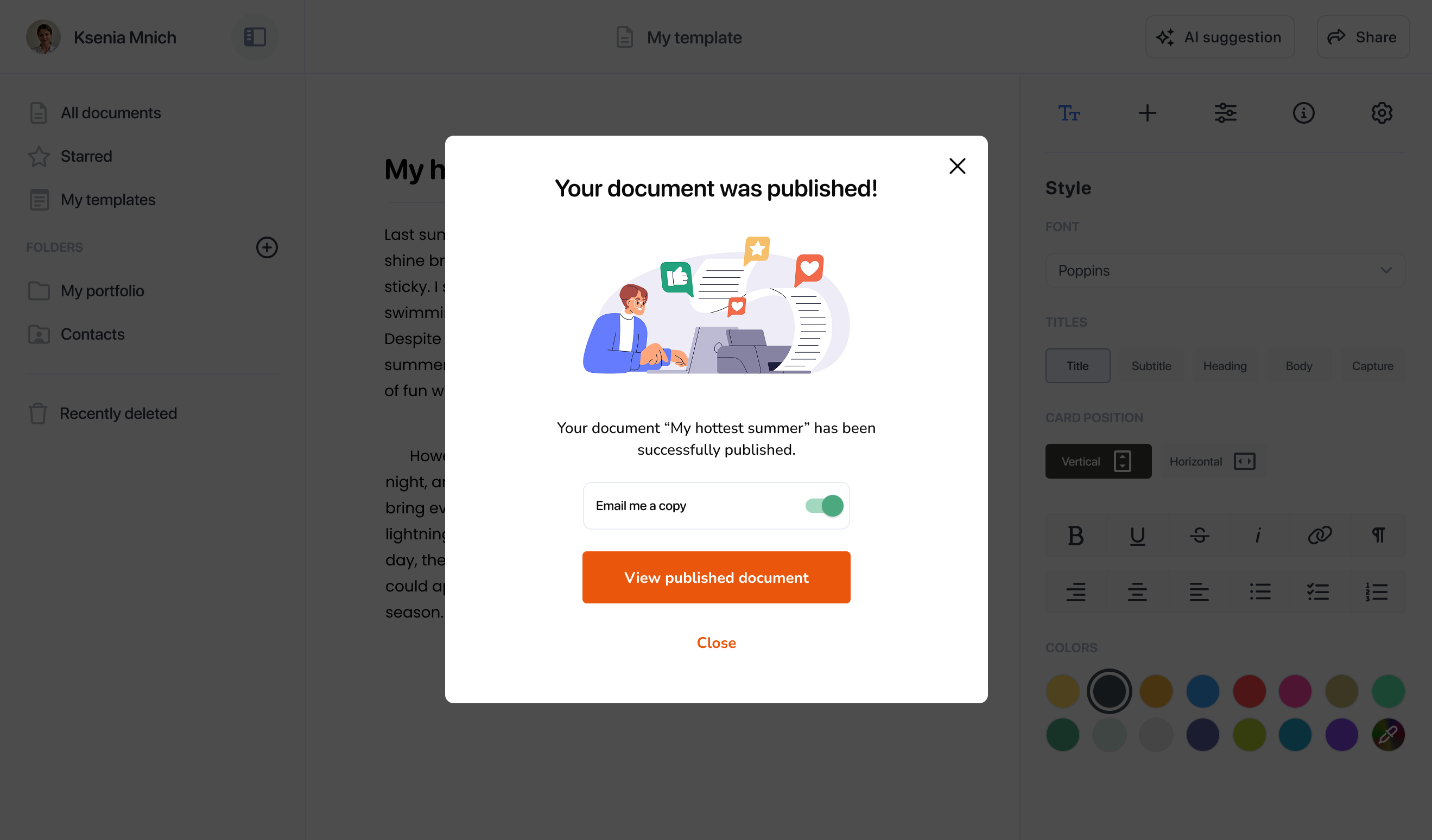
Design a post-action confirmation screen for a form submission or purchase. The screen should clearly answer three questions: did it work, what was captured, and what happens next? Make the success state feel immediate, but keep the layout practical and information-led.
Include a visible success indicator, a short confirmation message, and a compact summary of the submitted details or order contents. If the action creates an ID, receipt, reference number, or timestamp, show it in a way users can copy or note quickly. Keep the summary readable without forcing expansion.
Give the user one primary next step, such as view receipt, continue, or go to dashboard, plus a secondary option like back to home or close. If processing is still happening, show progress clearly; if something failed, keep the entered context and offer a retry path without making the user start over.
Design for trust and accessibility: strong contrast, keyboard focus, readable hierarchy, and status text that does not rely on color alone. The screen should feel calm, certain, and easy to leave.
What to deliver
- Design the confirmation screen layout.
- Show the completed action summary.
- Add a clear success message and status icon.
- Include one primary next step and one secondary exit.
- Handle loading, error, and retry states.
Infuse the design with positive reinforcement, using comforting colors and checkmark icons to invoke a sense of accomplishment and certainty.