Gallery
See what others have created
articulatedceramic
@articulatedceramic
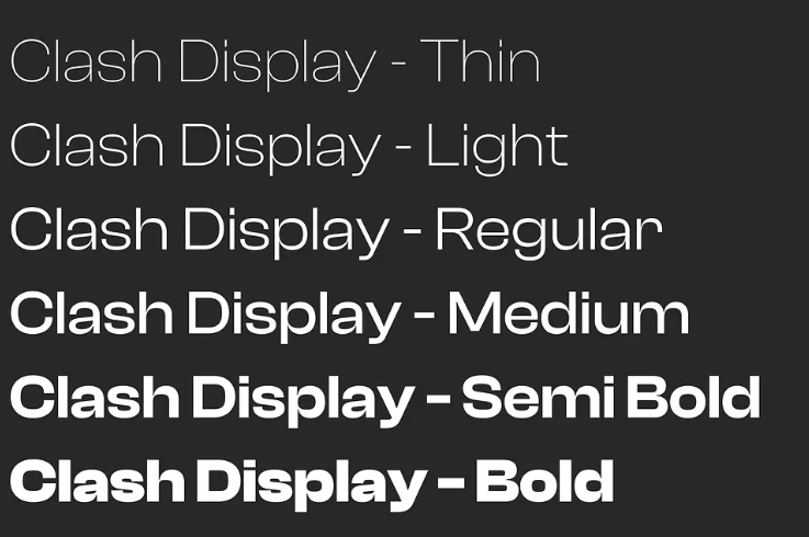
Typography
Design one hi-fi screen where typography does the heavy lifting. Use a real content structure, not placeholder labels: a page title, section headings, body copy, supporting text, and one clear call to action. The point is to show a complete type system in use, not a style sample. Build a clear hierarchy with size, weight, spacing, and line height. Make the differences between heading levels easy to read at a glance. Keep body copy comfortable to scan, with sensible line length and paragraph spacing. If you use a display font or a distinctive brand face, keep it under control; the page should still read cleanly. Include one responsive state for a smaller screen. The same content should reflow without collapsing into a wall of text or losing hierarchy. Show that the type scale still works when space gets tight, and that the layout supports reading before decoration.
What to deliver
- Set a type scale for heading, body, caption, and button text
- Compose one hi-fi screen that uses the scale across a real content layout
- Show weight, size, and spacing differences between hierarchy levels
- Demonstrate line length and line-height choices in a text-heavy section
- Include one mobile breakpoint where the type system still holds
Have fun with typography by experimenting with font pairings. Try combining a serif with a sans-serif to add visual interest to your design, but remember to maintain readability!