Gallery
See what others have created
julicaon
@julicaon
Showing & Hiding
Design a single show/hide pattern for a real product surface, such as an advanced filter panel, a password reveal, an expandable details section, or a modal that can be dismissed and reopened. Pick one and make the trigger, revealed content, and collapsed state feel like parts of the same system.
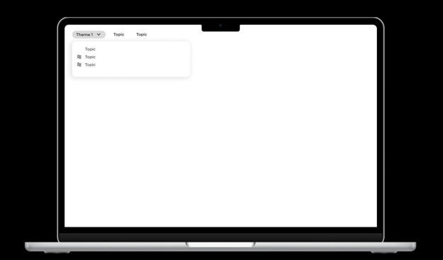
Show the default state first. The user should understand what is hidden, why it is hidden, and what action will reveal it. When the content opens, keep the layout stable and make the change easy to scan. If the revealed content pushes other UI out of view, show how that shift is handled.
Include the reverse action as clearly as the reveal. The label, icon, or control state should change to match what is currently visible. If the hidden content contains important context or actions, show how those remain discoverable without forcing the user to expand everything at once.
Treat motion as support, not decoration. The interaction should read instantly in both states, with clear hierarchy, predictable placement, and a clean exit path back to the collapsed view.
What to deliver
- Design one show/hide interaction with the trigger, revealed content, and hidden state.
- Include the open, closing, and collapsed states in the same flow.
- Show how the control label changes when content is hidden versus visible.
- Add one edge case where the hidden content affects layout or nearby actions.
Combine visibility cues like changes in icons (e.g., '+' turns to '-'), animation, or color shifts to clearly communicate transitions in the 'Showing & Hiding' flow. This will engage users and improve usability.