Gallery
See what others have created
thelazydesigner
@thelazydesigner
Date Picker
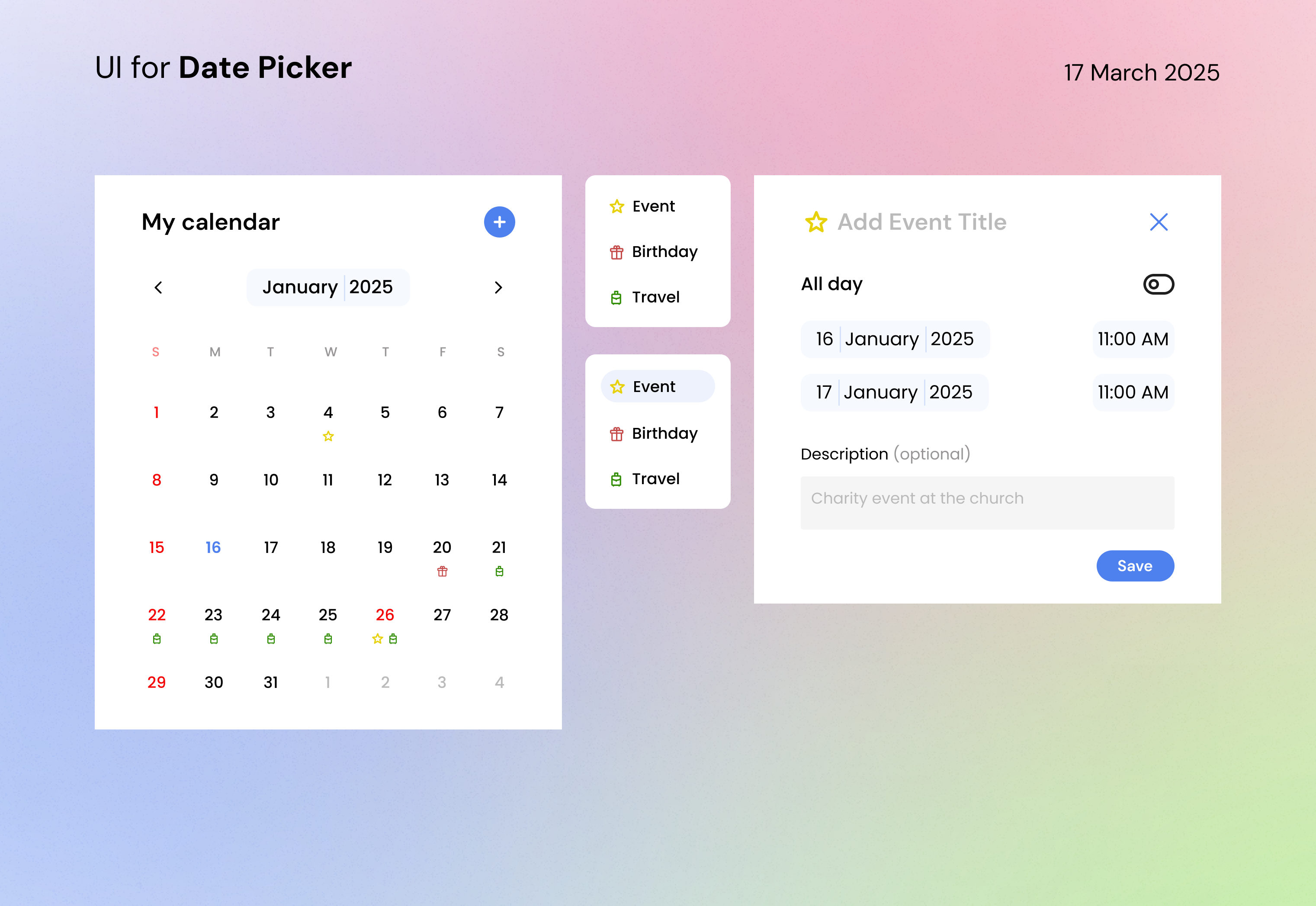
Design a date picker that feels precise, fast, and hard to misread. The core view should show a month grid with weekday labels, a clear current-month header, and controls for moving backward and forward through time. Make today, the selected date, and unavailable dates visually distinct without depending on color alone.
Include the interaction states that matter: hover, focus, pressed, disabled, invalid, and cleared. If the component supports keyboard input or manual typing, show how the typed value is validated and how errors are surfaced without wiping the user’s entry. If the date picker opens as a popover, keep the trigger and calendar connected; if it lives inside a form, make the affordance obvious and the layout stable.
Show the component in at least one realistic use case, such as booking, scheduling, or birthdate entry. The design should make it easy to pick a nearby date, jump across months when needed, and confirm the choice with one clear primary action. If there is a cancel or clear action, it should be easy to find and should not compete with selection.
What to deliver
- Design the calendar surface with month navigation and a visible current-month header.
- Show single-date selection, hover, disabled, and invalid states.
- Include a date input or trigger that opens the picker.
- Add confirm and cancel actions, plus a clear selected-date state.
- Show a range of month/year navigation controls if needed for fast jumps.
Incorporate a 'Today' button for quicker navigation to the current date, adding a small convenience that users will appreciate.