Gallery
See what others have created
ragingbatch
@ragingbatch
Charts
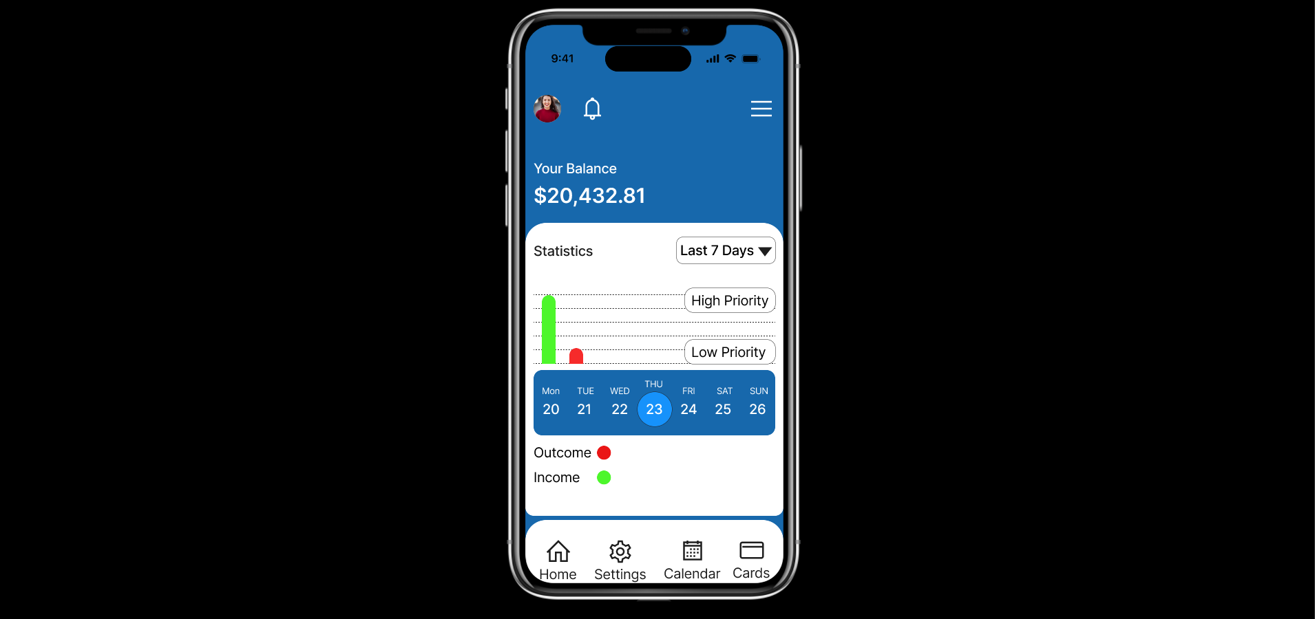
Design a charting surface for an analytics product, not a generic gallery of graphs. Pick a real data set, then show how it is summarized across 2–3 chart types on one screen: for example, trend over time, category breakdown, and comparison between series.
The layout should include chart title, time range, legend, axes, units, and a visible control row for filters or date-range selection. Show how the same data behaves at different densities: a normal state, a dense state with crowded labels, and a focused state where one series or point is selected.
Make interaction concrete. Show what happens on hover or tap, how a tooltip is anchored, how the selected point is highlighted, and how users switch between chart types or filter the data. If the chart is touch-first, the hit area and inspection pattern should work without a mouse.
What to deliver
- Design a chart canvas with 2–3 chart types in one screen
- Add a clear legend, axis labels, and unit labels
- Show hover/tap inspection on a data point with tooltip details
- Include filters for series, date range, or metric selection
- Add an empty/no-data state and a loading state
Leverage color coding and legends to make data patterns and trends immediately apparent and intuitive.