Gallery
See what others have created
sotework
@sotework
Flag
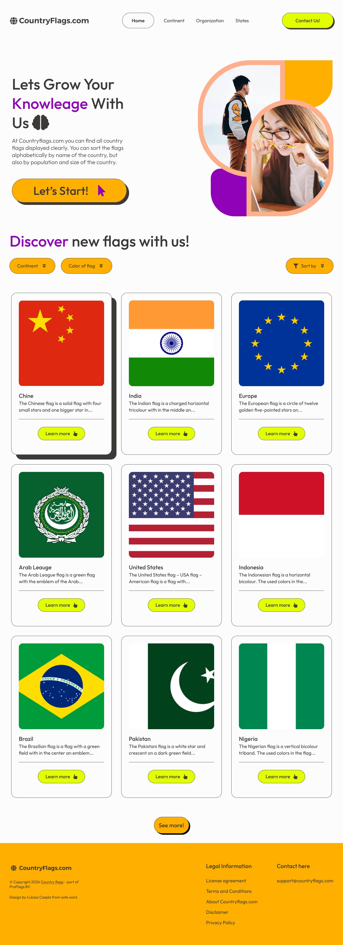
Design a flag component for browsing and viewing national or organizational flags. The core UI should make the flag itself the hero, with the name and region or organization label secondary and always visible.
Build the component in two modes: a compact gallery tile and an expanded detail view. The tile should support quick scanning in a grid; the detail view should show the full flag, a short facts block, and optional notes like symbolism, proportions, or adoption date.
Include clear interaction states for default, hover, selected, loading, and empty results. If the user opens a flag from a list, keep the selected item obvious and preserve context so they can move to the next flag without losing their place.
Use strong contrast, readable type, and keyboard-friendly controls. The design should work whether the flags are being browsed as a collection or inspected one at a time.
What to deliver
- Design a flag card with the flag image, name, and country or organization label.
- Add a selection state for the active flag and a hover state for browse mode.
- Include a compact details panel for basic facts like colors, proportions, and meaning.
- Show empty and loading states for the gallery list.
- Make the component work in a grid and in a single-detail view.
Include a color palette tool that allows users to understand the meaning behind the flag colors, making the experience both educational and interactive.