Gallery
See what others have created
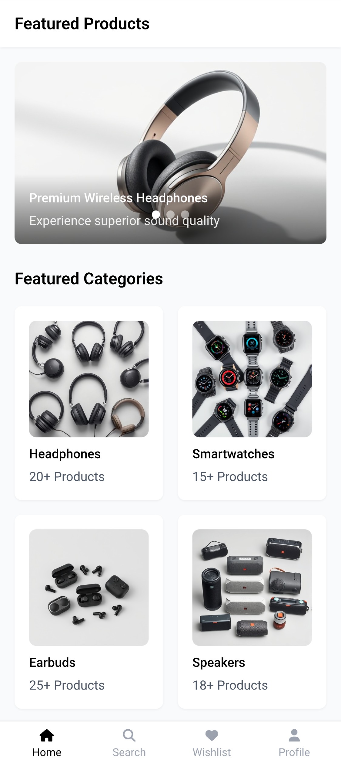
conservationjuxtaposition
@conservationjuxtaposition
Carousel
Design a carousel component for a product page or dashboard card rail, where only part of the collection fits in view at once. Show the viewport, one active slide, adjacent slides peeking in, and the spacing that makes it clear more content exists off-screen.
Include manual navigation with previous/next buttons and a clear indicator pattern such as dots, numbers, or a progress bar. Show how the component behaves when the user is on the first and last slide, and make the current position readable at a glance.
Add autoplay as an optional state with a visible pause control. The component should not feel like a moving banner with no way to stop it; manual interaction should take priority and the active slide should remain obvious during motion.
Design the component for accessibility: visible focus states, button labels, and a structure that works without relying on motion alone. If content is loading or a slide fails, show a stable fallback state that keeps the carousel usable.
What to deliver
- Design the carousel frame, slide content, and visible viewport.
- Add previous/next controls and pagination indicators.
- Show autoplay state with pause/resume behavior.
- Include one focused slide state and one off-screen slide state.
- Add empty/loading treatment if slide content is not ready.
Incorporate a pause-on-hover feature to enhance usability, allowing users time to interact with the content on each slide without feeling rushed by automatic transitions.