Gallery
See what others have created
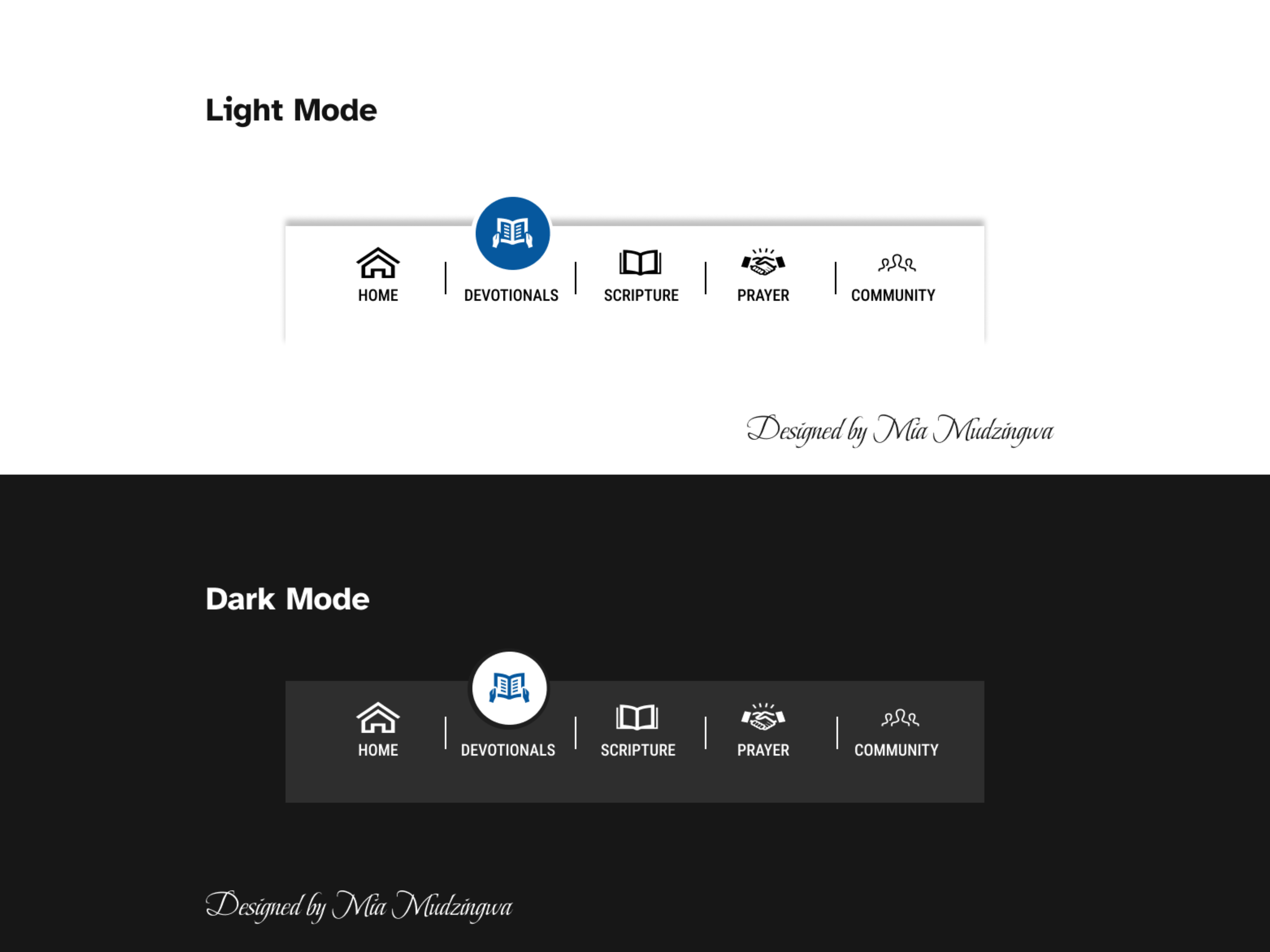
design_with_mia
@design_with_mia
Tab views
Design a tab view component for a product interface with 3–5 sections. The tabs should feel like navigation between peer views, not like a generic button row. Show one selected tab and the panel content it reveals.
Use a real layout, not just isolated pills. Define spacing, alignment, and the relationship between the tab list and the content area. Include an underline, fill, or other selected-state treatment that works at a glance, plus hover, focus, and disabled states.
Handle the common edge cases: long labels, narrow containers, and tab sets that overflow. If tabs scroll or collapse into an overflow menu, show how the user knows more items exist and how the active tab stays visible.
Keep the content area stable when switching tabs. The active view should be easy to scan, the selected tab should be obvious, and the component should work in both dense admin-style layouts and lighter product screens.
What to deliver
- Design a tab bar with 3–5 tabs and one clear active state
- Show the tab panel content for each selected tab
- Include horizontal and vertical variants if space changes the pattern
- Add overflow behavior for when tabs exceed the available width
- Define hover, focus, disabled, and selected states
Leverage icons and concise labels to make tabs both visually appealing and easily navigable.