Gallery
See what others have created
r_tist
@r_tist
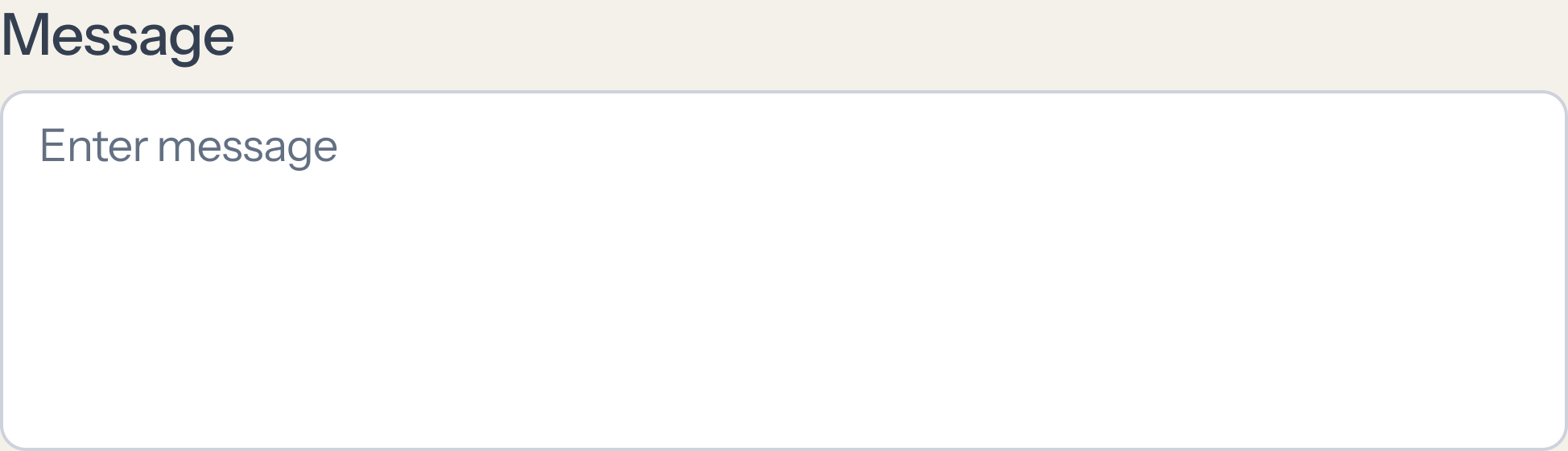
Textarea
Design a textarea component for longer user input such as comments, notes, feedback, or descriptions. It should feel distinct from a single-line input: taller by default, clearly bounded, and ready for multi-line typing from the first frame. Define the full component anatomy: label, optional helper text, placeholder, input area, and optional character count. Show how the component behaves in default, focus, filled, error, disabled, and read-only states. Keep spacing and alignment stable so validation or helper text does not shift the layout. Decide whether the field is resizable or fixed-height, and make that choice visible in the design. If resize is allowed, show the handle and the minimum/maximum bounds. If a character limit exists, place the count where it can be checked without hunting, and make over-limit feedback direct and specific. Include accessibility cues: clear focus state, readable contrast, and a pattern that works with keyboard and assistive tech. The finished component should be easy to scan, easy to type into, and predictable when content gets long.
What to deliver
- Design the default textarea with label, placeholder, and visible bounds
- Add focused, filled, disabled, and error states
- Show helper text and character count placement
- Include resize affordance or fixed-height variant
- Define keyboard and screen reader-friendly interactions
Emphasize accessibility by ensuring that the text area's contrast and font size meet industry standards for readability. Remember, inclusivity in design allows your product to appeal to a wider range of users!