Gallery
See what others have created
muktharayo
@muktharayo
Button group
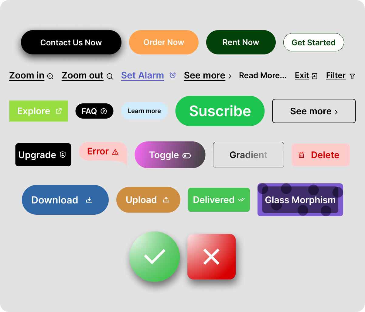
Design a button group as a single control made of related actions. Keep the buttons visually connected with shared height, radius treatment, and spacing rules. One action should read as primary; the rest should support it without competing for attention.
Show a few realistic configurations: a compact 2-button group, a 3-button group with a selected state, and a longer group that needs to wrap or stack on smaller widths. If icons are used, keep alignment and hit areas consistent across the set.
Include hover, active, selected, disabled, and focus states. The selected button should be obvious at a glance, and the keyboard focus ring should still be visible when buttons sit flush together. If the group breaks into multiple rows, keep the grouping logic clear so users can still understand the full set of actions.
What to deliver
- Design a 2–5 button group with one primary action and secondary options.
- Show horizontal and stacked versions for different widths.
- Define selected, hover, disabled, and focus states.
- Include spacing and divider rules so the group reads as one control.
- Show how the group behaves when labels are long or icons are included.
Group buttons in a way that delights users by creating a clear and intuitive segmentation of actions, like using subtle gradients or slight spacing to differentiate each button.