Gallery
See what others have created
khanhdokuriitsu
@khanhdokuriitsu
Transferring Money & Donating
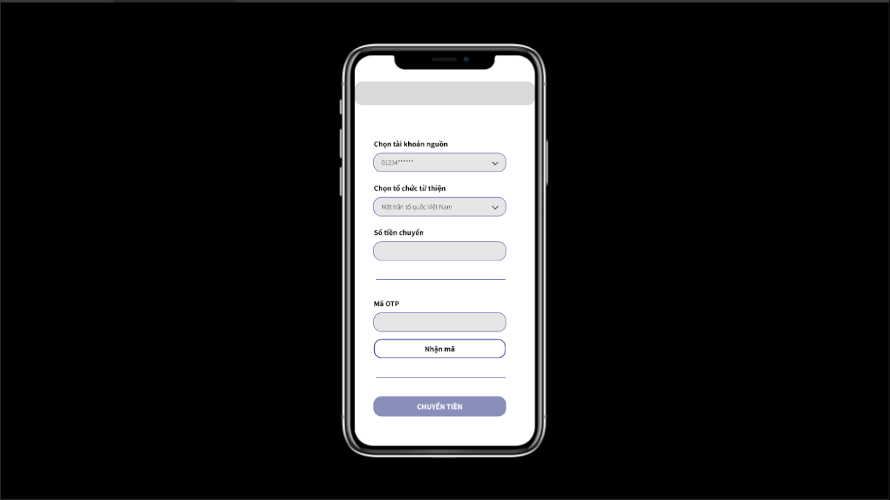
Design the full money-transfer and donation flow as a set of connected screens, not a single checkout moment. Start with an entry screen that clearly separates sending to a person from donating to an organization. The first choice should be obvious, and the user should know what kind of transaction they are about to make before they continue.
From there, design recipient or charity selection with search, recent choices, and a selected-state summary that stays visible as the user moves forward. Amount entry should support preset values and custom input. If the flow includes fees, matching, or donation suggestions, show them beside the amount so the user can understand the total before review.
The review screen should read like a transaction receipt in progress: who gets the money, how much, any fee or tip, funding source, and when it will be sent. Make edit actions obvious for each section. Finish with confirmation states for success, pending verification, and failure, each with a clear next step back into the flow.
What to deliver
- Design the transfer/donation entry screen with a clear split between sending money and donating.
- Show recipient/charity selection with search, recents, and a selected-state summary.
- Design amount entry with presets, custom input, and visible fees or suggested donation options.
- Create a review screen that summarizes who gets paid, how much, and when it leaves the account.
- Include confirmation, pending, success, and failure states with clear next steps.
Infuse storytelling into the design by showing the impact of donations with images or testimonials. For transfers, ease anxiety with clear confirmation screens and the option to track transactions.