Gallery
See what others have created
battereddinner
@battereddinner
Verifying
Design the verification flow as a focused checkpoint, not a generic confirmation prompt. Pick one primary use case: enter a one-time code, confirm an email address, verify a phone number, or approve an identity check. The screen should make the target explicit, show where the code came from, and give the user one obvious way to continue.
Include the states that happen around the code entry moment: waiting for input, submitting, invalid code, expired code, resend available, and verified. Errors should stay tied to the entered value and preserve what the user typed. If a resend is available, show the cooldown or timing clearly so the user knows when they can try again.
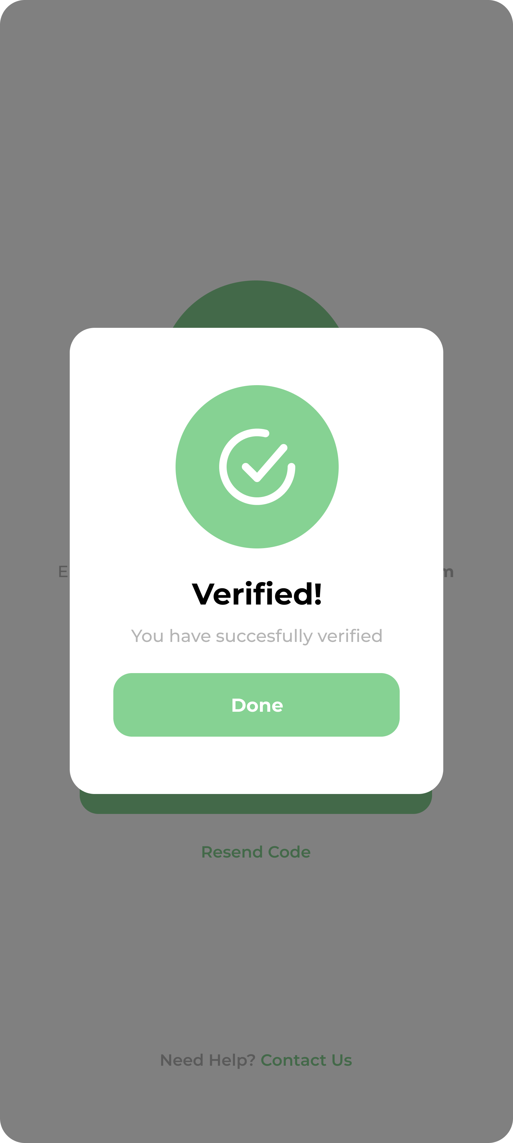
When verification succeeds, the result should feel immediate and directional. Show the verified state, then hand off to the next step without making the user wonder if they are done. If the flow includes terms acceptance instead of a code, keep the language specific and make the commitment point obvious before the user confirms.
What to deliver
- Design the verification entry screen with a clear code field and resend action.
- Show the confirmation step for email, SMS, or identity verification.
- Include loading, invalid, expired, and success states.
- Keep the next step visible after verification completes.
Use visual cues like a checkmark icon or color changes to indicate successful verification, enhancing user confidence.