Gallery
See what others have created
rooman_v
@rooman_v
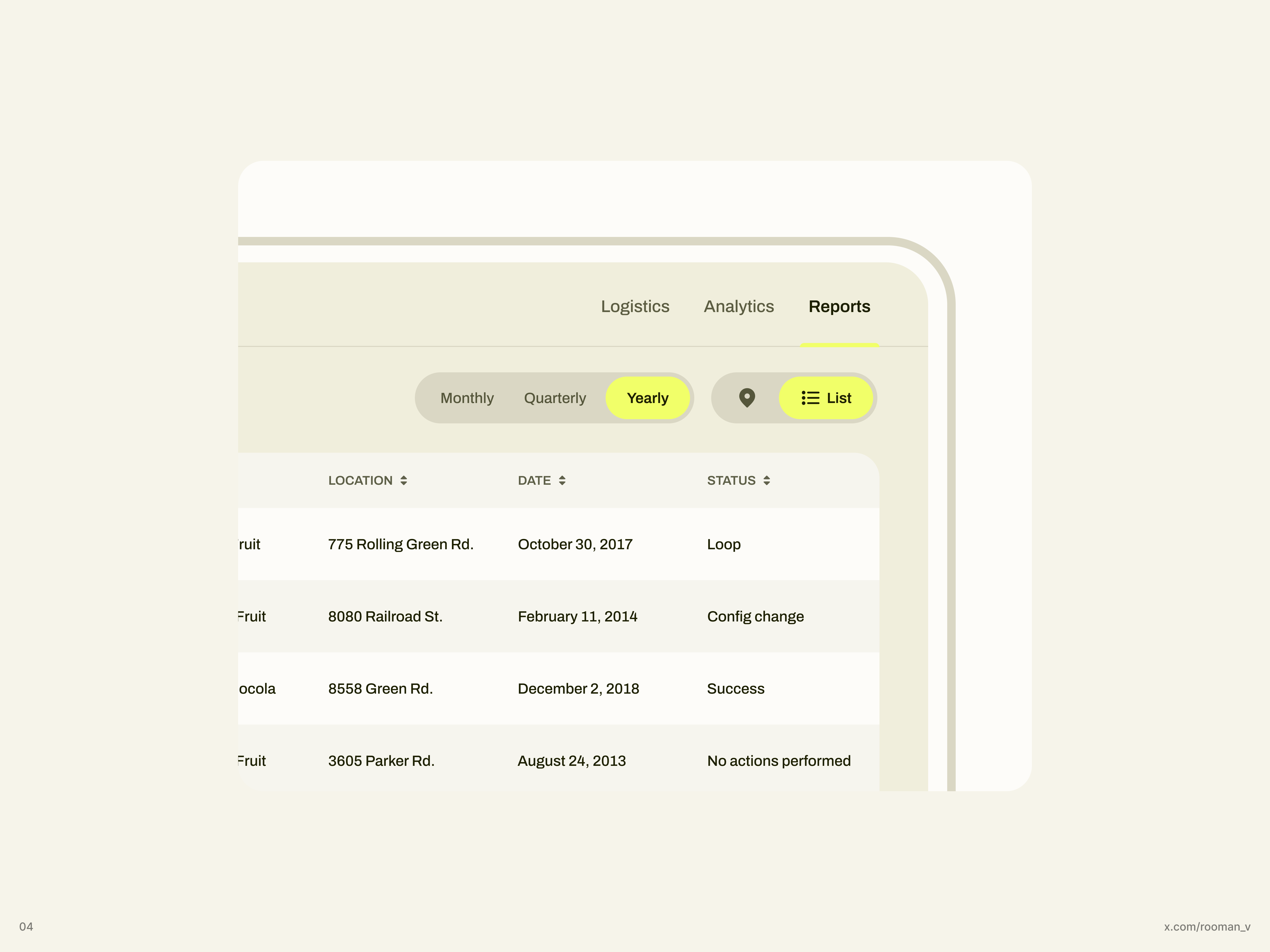
Tab & Segmented Control
Design two related controls: a tab bar for switching views and a segmented control for filtering within the current view. Keep the difference clear in both layout and behavior. Tabs should feel like navigation between sections; segmented controls should feel like mutually exclusive filters that update content in place.
Build each component with 3–5 options and a clearly selected item. Show the full interaction set: default, hover, pressed, focus, and disabled. Include at least one example with long labels and one with icons so spacing, truncation, and alignment are solved instead of implied.
Show how each control behaves when space is tight. If labels do not fit, decide whether they wrap, truncate, or scroll, and make that choice visible in the design. The selected state should hold up in light and dark or high-contrast styling if you choose to include them, but the main requirement is that the control reads quickly and the active choice is unmistakable.
What to deliver
- Design a tab bar with 3–5 tabs and one active state
- Design a segmented control with 3–4 options and one selected state
- Show hover, pressed, disabled, and focus states
- Include long-label, icon+label, and overflow handling
- Show content change or filter change tied to the selected segment
Inject personality into your tabs or segments by using distinctive icons or color coding. This helps users remember their function at a glance.