Gallery
See what others have created
craftyunreality
@craftyunreality
List
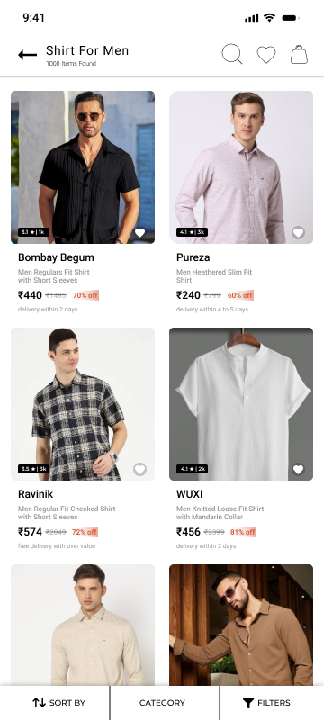
Design a list component for a product UI with a clear row pattern and a strong visual rhythm. Each row should support a primary label, a secondary line or metadata, and an optional trailing action or status. Keep the component flexible enough to work for items like messages, files, orders, or search results.
Show the list in its default browsing state with several items visible at once. Include one selected row, one disabled row, and one row with a longer title to test truncation and spacing. The list should read cleanly at a glance, with hierarchy driven by typography, alignment, and whitespace rather than heavy decoration.
Add one lightweight control above the list, such as sort or filter, if it helps the pattern feel complete. If you include interaction states, make them practical: hover, pressed, and empty results should all preserve context and point to the next step. The component should feel ready to drop into a real app, not like a generic gallery mockup.
What to deliver
- Design a vertical list component with 5–8 visible items.
- Show one selected item and one disabled or unavailable item.
- Include a clear item layout: leading content, primary text, secondary text, and trailing metadata or action.
- Add a list header with optional sort or filter control.
- Show hover, pressed, and empty-state behavior if the list has no results.
Add a creative twist with subtle animations or micro-interactions when users hover over or select items from the list to enhance the experience!