Gallery
See what others have created
firmknife
@firmknife
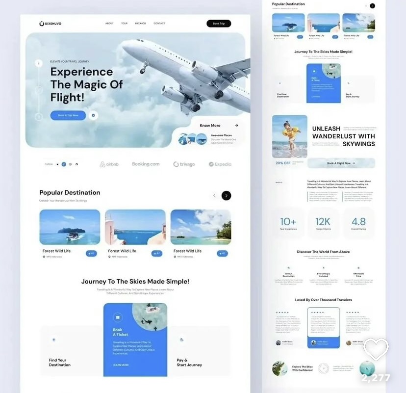
Multi-Column Layout
Design a multi-column content layout for a product or editorial page. The goal is to show how a page can hold several content types at once without losing structure. Treat the grid as the product: define column count, gutter size, alignment, and how content flows from one column to the next.
Start with a desktop layout that uses at least three columns. Use it to place a mix of text, cards, and media blocks, but keep the reading order obvious. Columns should feel related through shared spacing and baseline rhythm, not through decorative tricks. If one column is much denser than the others, show how the layout still feels balanced.
Then adapt the same system for tablet and mobile. Show where columns collapse, what stays side by side, and what stacks. Make sure the layout still works when images are missing, copy runs long, or one column has much more content than the rest. The final screen should read cleanly at a glance and still feel deliberate at every breakpoint.
What to deliver
- Design a 3-column content section with a clear grid and spacing system.
- Define how text, media, and cards flow across columns at desktop widths.
- Show a responsive collapse to 2 columns and then 1 column on smaller screens.
- Include one example of uneven column content and how the layout still stays balanced.
- Specify rules for gutters, alignment, and vertical rhythm.
Incorporate a responsive design mindset, ensuring the multi-column layout adapts gracefully on various screen sizes, maintaining readability and user experience.