Gallery
See what others have created
fury
@fury
Drop Zone & File Uploader
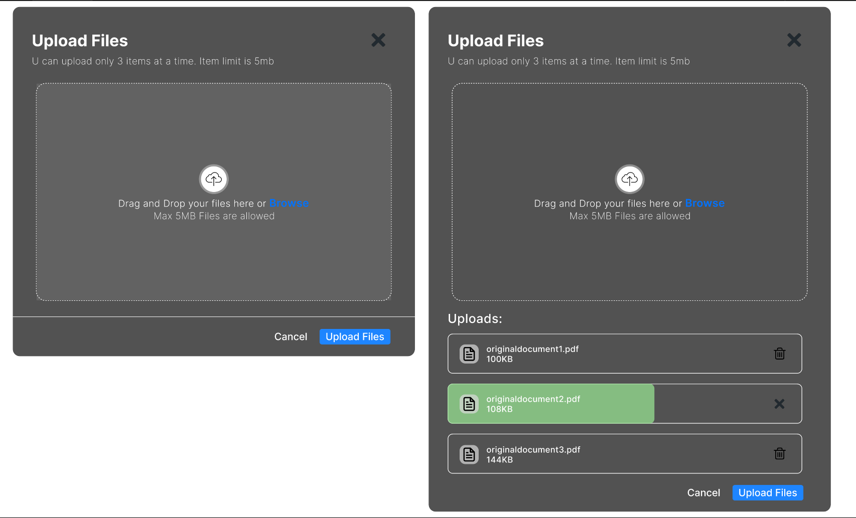
Design a file upload component for a desktop web app that supports both drag-and-drop and click-to-browse. The default state should clearly show the drop target, accepted file types, and size limits without making the area feel like a button disguised as a panel. Users should understand where to drop files and what happens next before they interact.
When a file is dragged over the zone, the component should switch to a distinct hover state with stronger contrast and a visible drop cue. After selection or drop, show each file in a queue with filename, type, size, and upload status. Use progress indicators for active uploads, and keep cancel or remove actions attached to each file row, not buried in a menu.
Handle invalid files inline. If a file is too large, unsupported, or fails to upload, show the error next to that specific file and keep the original filename visible. Failed items should offer retry. Successful uploads should resolve into a clear completed state, either in the queue or as a compact uploaded list, depending on how many files are added at once.
The layout should stay calm while multiple files move through different states. Keep the drop zone readable when idle, but let the queue do the heavy lifting once uploads begin. The whole pattern should make status, recovery, and control obvious at a glance.
What to deliver
- Design the default drop zone state with clear affordance and one primary upload action.
- Design drag-over, uploading, success, and error states for the same component.
- Show file list behavior for queued, uploaded, failed, and removable items.
- Include progress, cancel, and retry controls where they belong.
- Define how accepted file types and size limits are surfaced before and after selection.
Lean into the drag-and-drop metaphor by visually mimicking physical interaction, like a file hovering over a desk, to make uploading intuitive and delightful.