Gallery
See what others have created

misaka
@misaka
Lozenge
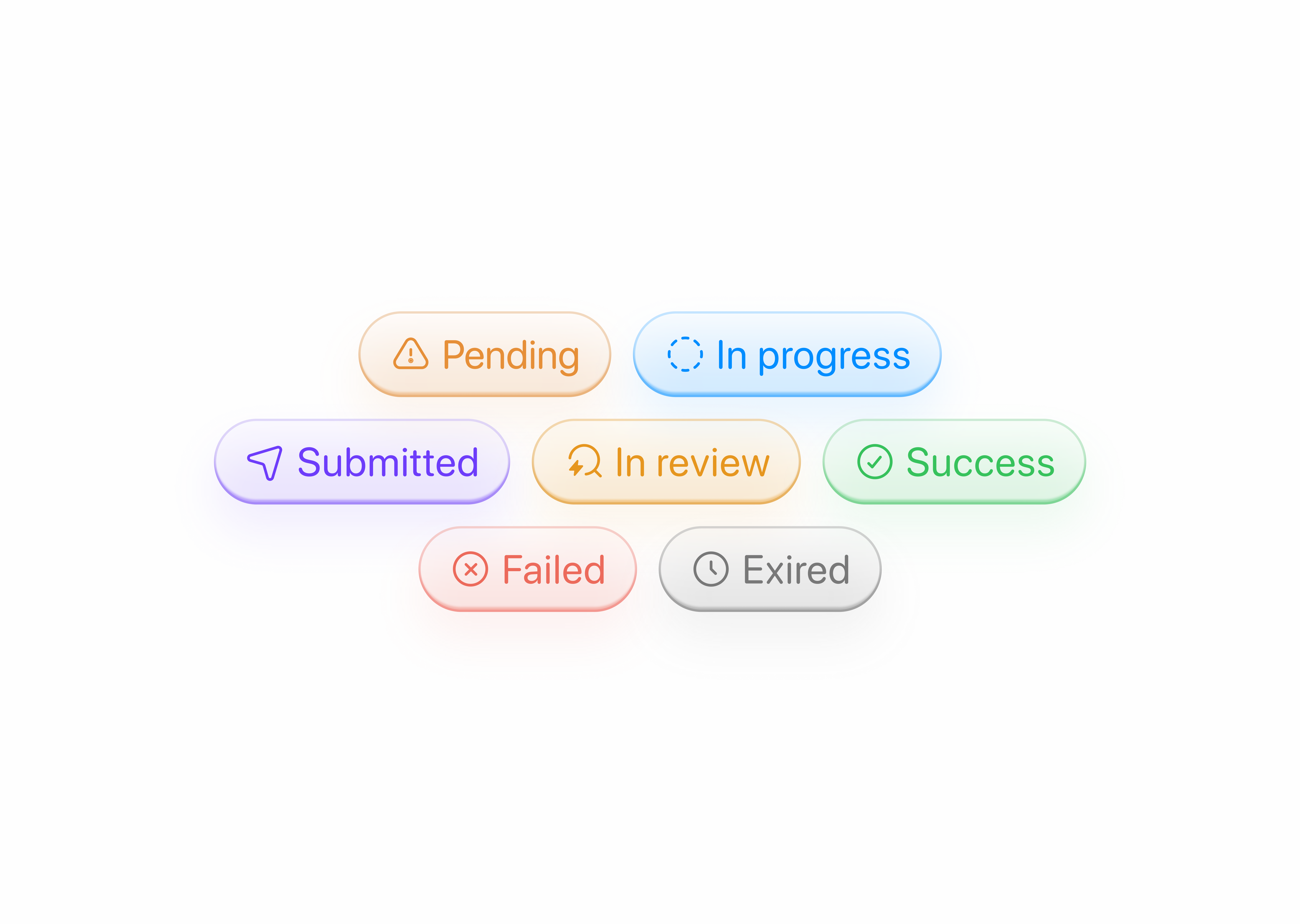
Design a lozenge component: a compact, rounded label that can act as a tag, status chip, or small action button. The shape should feel distinct at a glance, with tight horizontal padding, soft corners, and enough visual weight to hold short text or a small icon.
Build the core component in a few clear variants: text only, icon plus text, and removable with a close affordance. Show default, hover, pressed, and disabled states so the interaction model is obvious. Keep the motion and color changes minimal; the lozenge should feel crisp, not bouncy.
Place the lozenge in context in at least two ways: inside a list row as a status marker, and in a control group as a selectable filter or action. The component should stay readable at small sizes, align cleanly with adjacent UI, and preserve its shape when content changes.
What to deliver
- Design a lozenge chip in default, hover, pressed, and disabled states
- Show the lozenge used as a tag, status badge, and pill button
- Define icon, text-only, and removable variants
- Include one compact layout with multiple lozenges in a row
Inject a touch of creativity by experimenting with gradients or subtle animations to make your lozenge elements pop. Remember, the lozenge shape is all about smooth curves and comfort.