Gallery
See what others have created
level_raise
@level_raise
Side Drawer Navigation
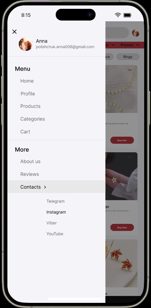
Design the hamburger-triggered side drawer for a mobile app. It should feel like a native navigation surface, not a floating panel pasted on top of the screen.
The drawer opens from the edge and lists the app’s main destinations in a clear order. Include enough hierarchy to make the current section, secondary links, and account-related items easy to tell apart.
This is a navigation challenge, so the key moment is the first scan after the drawer opens. The user should be able to tell where they are, where they can go, and what stays persistent across the app.
Treat the drawer as part of the app shell. Think about how the underlying screen is dimmed or shifted, how the menu closes, and how the selected item is represented without adding clutter.
What to deliver
- Design the closed hamburger state in a mobile app header.
- Design the drawer open state with a realistic list of navigation links.
- Show the active destination and at least one grouped section.
- Include a clear close affordance and tapping outside the drawer.
- Define the visual treatment of the dimmed or covered content behind the drawer.
Use spacing and grouping before icons or decoration; the drawer should read by structure first, not by visual noise.