Gallery
See what others have created
sheeshable
@sheeshable
Bottom Tab Bar Navigation
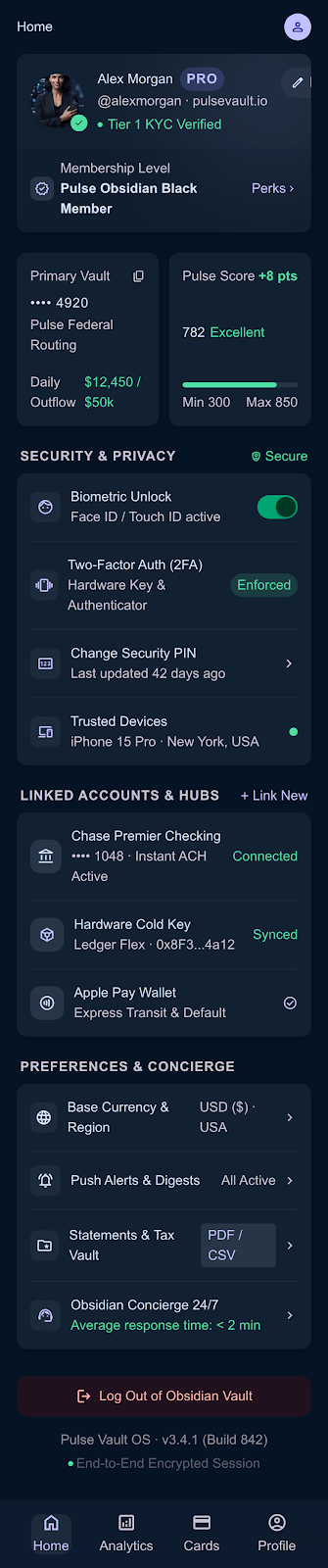
Design the mobile home screen with a fixed bottom tab bar for the app’s four main sections. Each tab needs an icon and a label, and the bar should feel native to a phone UI, not a desktop nav strip.
The screen starts on one section with its tab visibly active. The other three tabs stay available at all times, so the user can switch sections without hunting for a menu or back stack.
Focus on the active/inactive states, spacing, and how the bar sits above the system gesture area. The labels need to stay readable at a glance, even on a small device.
This is a simple navigation pattern, but the details matter: the selected state should be unmistakable, and the tap targets should feel easy to hit with a thumb.
What to deliver
- Design the default home screen with all four tabs visible.
- Show one tab in its active state and the other three inactive.
- Place icon and label together for each tab.
- Account for the safe area / gesture bar at the bottom.
- Make each tab look tappable at thumb reach.
Use a strong active state that changes both icon and label treatment; don’t rely on color alone.