Gallery
See what others have created
mare_di_mare
@mare_di_mare
Field
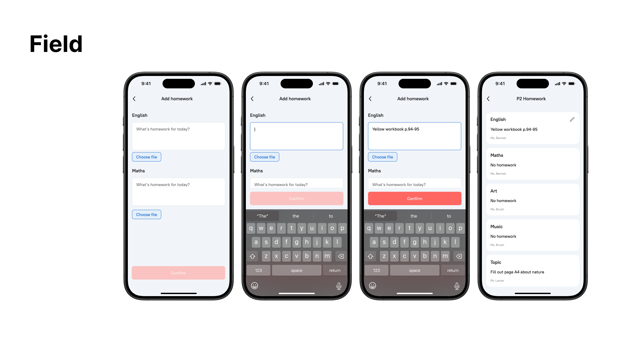
Design one reusable form field component for a product UI, not a whole form. Pick a single data type and make the field feel specific to that use case: text, email, date, amount, or file path. Show the label, the input area, and any helper text needed to explain format or constraints.
Build the component as a state set. Include default, hover, focus, filled, disabled, and error versions. If the field needs a prefix, suffix, unit label, or inline icon, keep it attached to the same control so the layout still reads as one field.
Error handling should stay local. Show one validation message, keep the entered value visible, and make the next step obvious. The final mockup should look like a production component that could be dropped into a settings page, checkout flow, or account form without redesign.
What to deliver
- Design a single form field with label, input area, and helper text
- Show default, focus, filled, and error states
- Include one clear validation message and recovery action
- Add optional affordances like prefix, suffix, or icon only if they help the field's purpose
Have fun with micro-interactions, like a subtle glow when the field is selected or a satisfying tick mark appearing upon successful validation!