Gallery
See what others have created
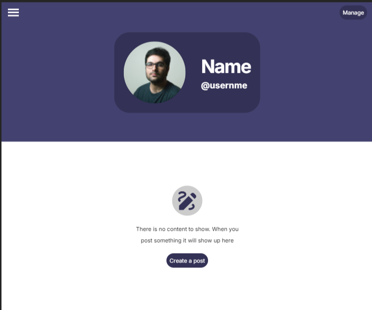
languiddouble_dealing
@languiddouble_dealing
Empty state
Design an empty state for a single product surface in your hi-fi mock. Pick one context and commit to it: a new dashboard with no data yet, an empty contact list, a blank project board, or an empty cart. The screen should explain what the user is seeing, why it is empty, and what they can do next.
Use a clear hierarchy: illustration or icon, short headline, one or two lines of supporting copy, then an action. The primary action should move the user toward filling the space, such as adding their first item, importing data, or browsing available content. If there is a useful secondary action, keep it subtle and optional.
Design the state so it still feels useful without content. The spacing, alignment, and tone should make the empty area feel intentional. Show at least one version for a first-time user and one for a truly empty or cleared state, with copy that matches each case.
What to deliver
- Design one empty state screen for a single product context
- Write a short headline and supporting body copy
- Add one primary call to action and one optional secondary action
- Include a simple illustration or icon that supports the message
- Show the empty state in both neutral and first-time-use variants
Breathe life into your empty state design by adding a touch of personality—think of playful copy or creative visuals that align with your brand's tone. Remember, a memorable empty state can significantly enhance user engagement!