Gallery
See what others have created
sheeshable
@sheeshable
Language Selection Onboarding
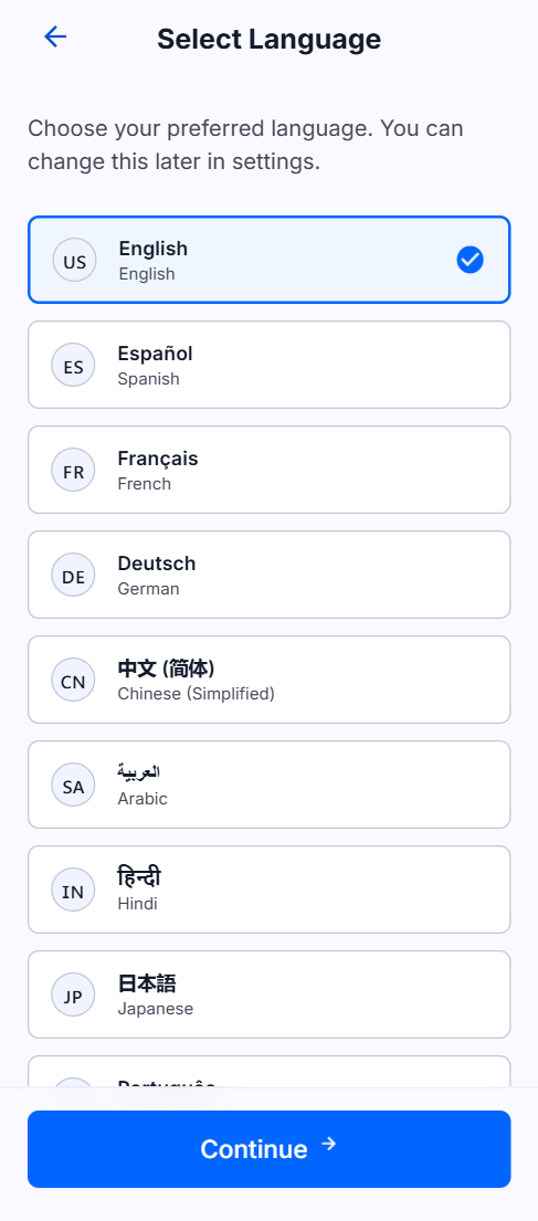
Design the first-run language selection screen for a mobile app. It appears before any account setup or app content, so the whole job is to help a new user pick a language fast and move on.
The list should use both flags and language names, with enough spacing and hierarchy that options are easy to scan on a small screen. Treat this like a native onboarding step, not a settings page.
The screen should make the current choice obvious and keep the primary next action close to the selection. If the list is long, think about how it scrolls without losing the selected state.
This is interesting because the UI has to work across scripts, text lengths, and familiar flag cues without becoming cluttered. The design should feel calm, clear, and ready for first launch.
What to deliver
- Design the language list for first launch
- Show the selected state for one language
- Place the continue action for the chosen language
- Include a long-list scroll treatment if needed
- Add a lightweight fallback for no selection
Use the language name as the main label and the flag as a quick visual cue; don’t rely on flags alone, since they can be ambiguous.