Gallery
See what others have created
sheeshable
@sheeshable
Collections
Design a Collections component for a content-heavy product where users browse saved sets of related items. Think playlists, recipe boards, asset packs, reading lists, or curated folders. The UI should make it easy to spot what each collection contains, how many items it holds, and whether it is public, private, or shared.
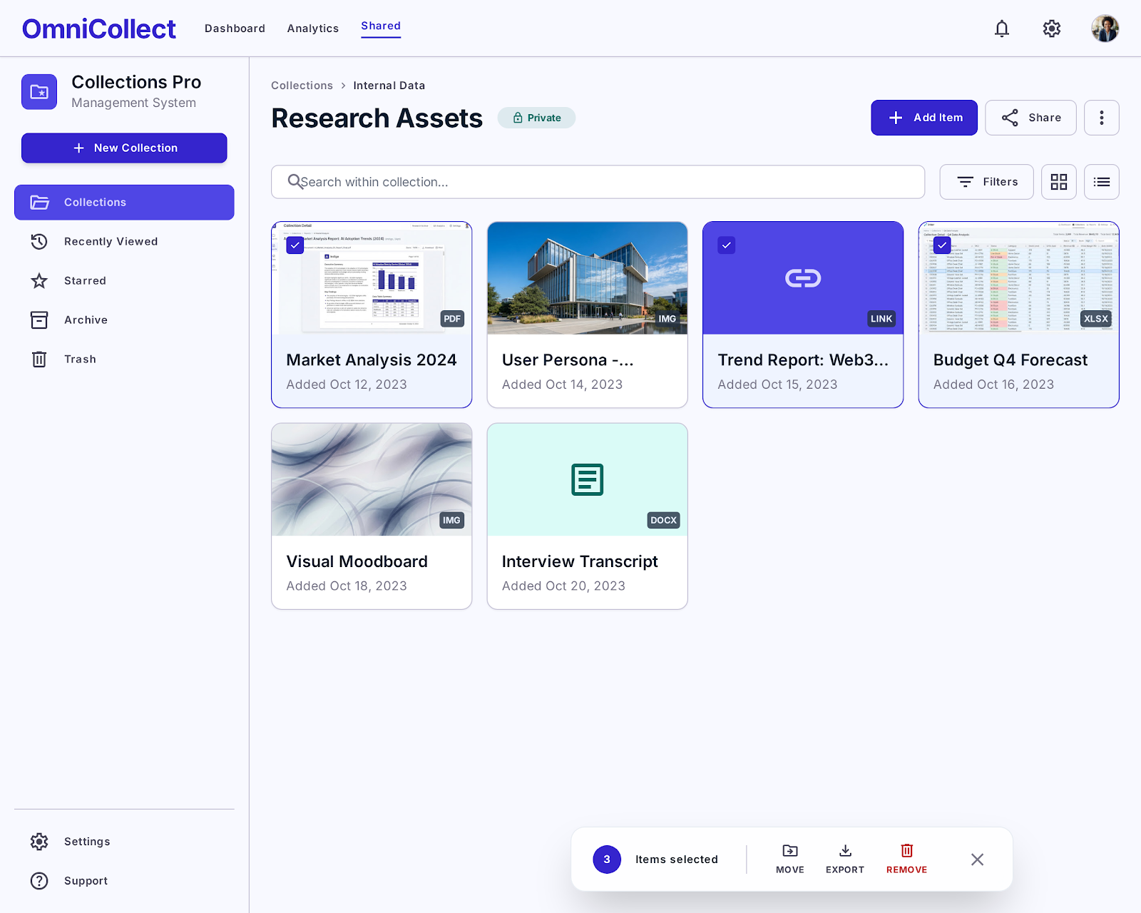
Create both the collections overview and a collection detail state. The overview should support scanning, sorting, and filtering across multiple collection types. The detail view should show the items inside one collection, with controls for search, sort order, and quick actions like save, share, rename, or add item.
Use hierarchy to separate collection metadata from item content. Show thumbnail previews or representative covers where useful, but keep labels and counts readable first. If a collection is empty, archived, or has no matches after filtering, show a clear recovery path instead of a dead end.
What to deliver
- Design a collections index with clear grouping, counts, and preview thumbnails.
- Add search and filter controls for narrowing collections by type, tag, or owner.
- Show a collection detail view with item grid, sort controls, and quick actions.
- Include empty, loading, and no-results states with a clear next step.
- Design one interaction for saving, sharing, or adding items to a collection.
Add a creative touch with micro-interactions for selecting items or navigating between collections to provide a delightful user experience.