Gallery
See what others have created
sheeshable
@sheeshable
Rating Control
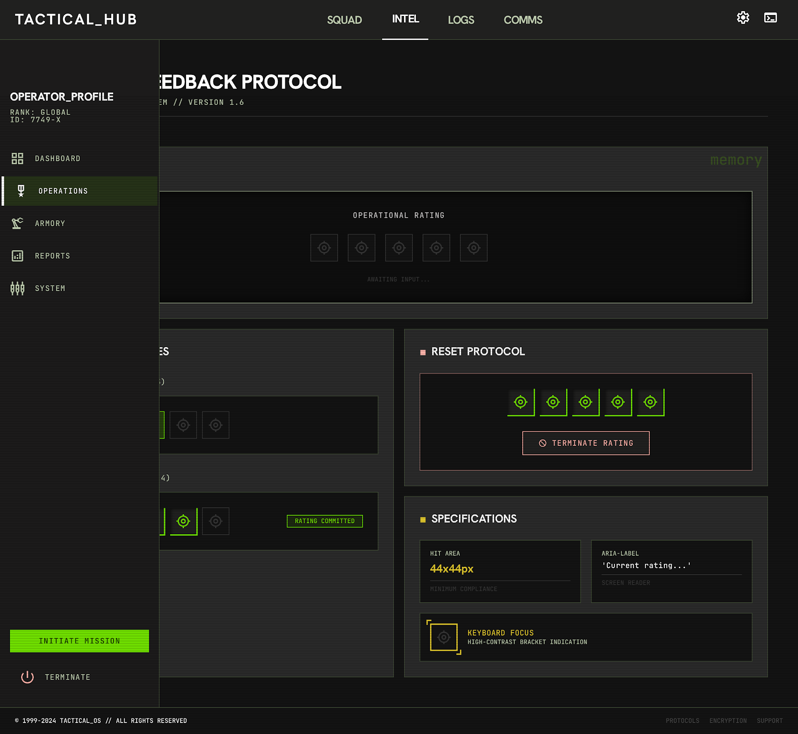
Design a rating control for giving quick feedback on a product, service, or piece of content. Treat it as a compact component that can live inside a form, card, or review flow without needing extra explanation.
Show the full state set: empty, hover preview, selected value, and keyboard focus. The component should make it obvious what is clickable, what value is being previewed, and what value has been committed. If the rating can be cleared or changed, show that path too.
Use a 5-step scale by default, but keep the pattern flexible enough to support other icons or labels when the product calls for it. Make the hit area generous enough for touch, and keep spacing tight enough that the control still works in dense layouts.
Include the current value in text for screen readers and make sure the visual state matches the announced state. The component should feel precise, fast, and easy to scan at a glance.
What to deliver
- Design the default unselected rating row with label and scale.
- Show hover, focus, and selected states for each step in the control.
- Define the tap/click target size and spacing for touch and pointer use.
- Add a clear reset or change path after a rating is set.
- Include an accessible text alternative for the current value.
Infuse a touch of creativity by customizing the star shapes or experimenting with alternative icons like hearts or thumbs for a unique user experience.