Gallery
See what others have created
designsbysathya
@designsbysathya
Card
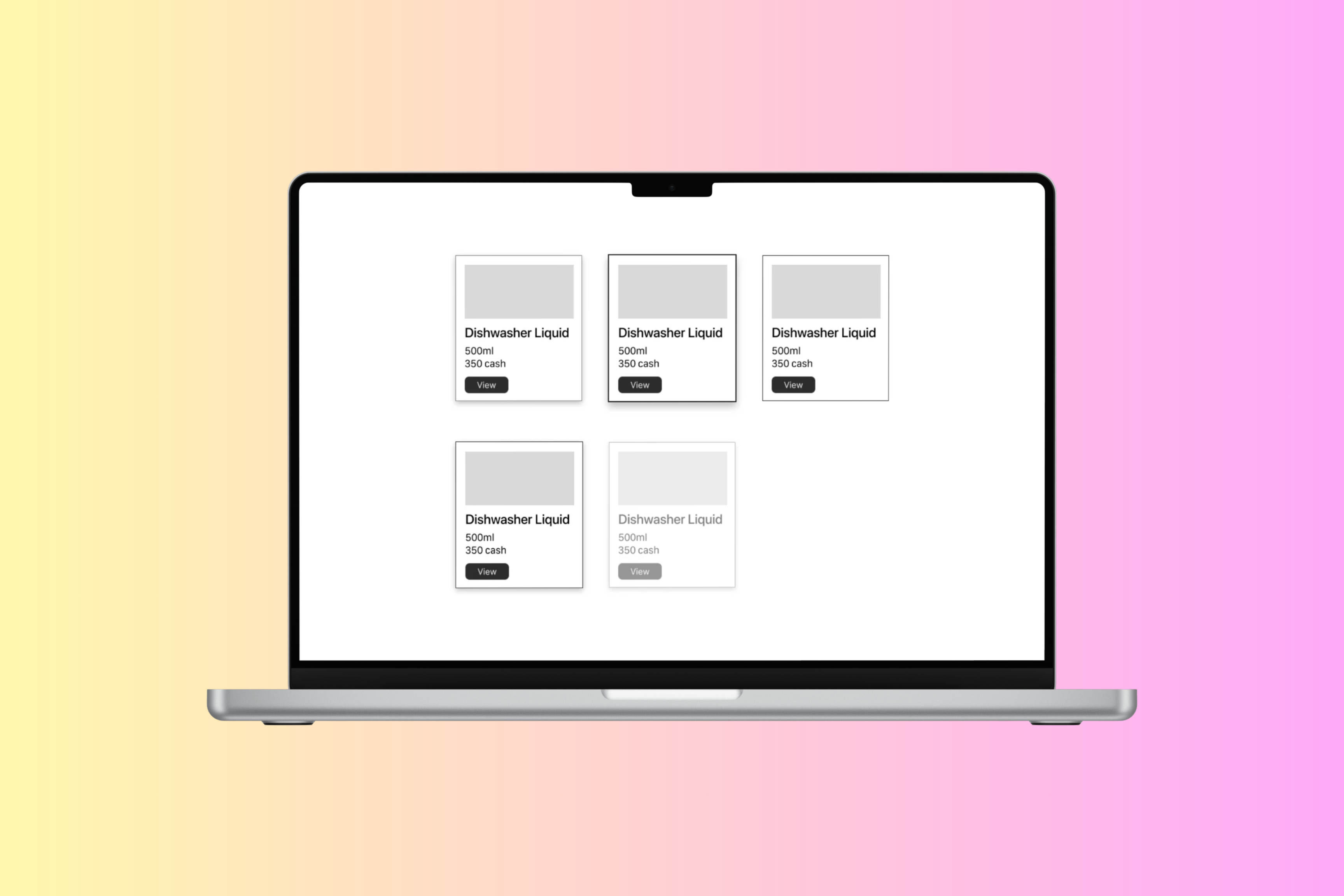
Design a reusable card component for a product, profile, or content summary. The card should fit cleanly into a grid or list and communicate its purpose in a few seconds. Keep the layout simple: one visual anchor, one title, one supporting line or two, and one primary action.
Define the card’s behavior in normal and interactive states. Show default, hover, pressed, focused, and disabled versions, plus one overflow pattern for longer text or secondary actions. If the card can expand, reveal details in place rather than jumping to a new surface.
Use spacing and typography to make the card easy to scan. Decide how image, icon, or avatar treatment changes by card type, and set rules for truncation, line count, and action placement so the component stays consistent across different content lengths.
What to deliver
- Design a single card component with title, supporting text, and one clear primary action.
- Include one visual area: image, avatar, or icon, depending on the card’s purpose.
- Define hover, pressed, focused, and disabled states.
- Show at least one expandable or overflow state for longer content.
- Specify spacing, type scale, and truncation rules for dense content.
Cards are the new 'windows' to content. To make your card stand out, try using micro-interactions like subtle animations or color changes when a user hovers over or clicks on it.