Gallery
See what others have created
placidflogging
@placidflogging
E-commerce Checkout Form
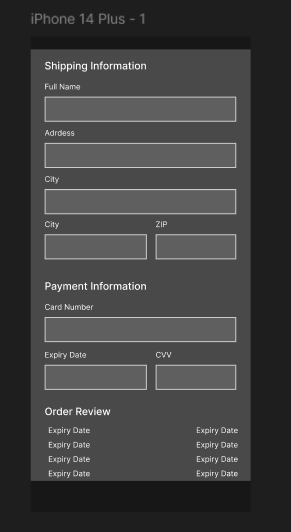
Design a mobile checkout form split into three clear sections: shipping info, payment, and order review. The screen should feel like a real purchase flow on a phone, where the user moves down the page without losing track of what’s already filled in.
Shipping fields need to work in a tight vertical layout with the right keyboard behavior, field labels, and spacing for thumb use. Payment should fit common mobile patterns like card entry, saved methods, or wallet selection without making the form feel crowded.
The review section should summarize items, totals, shipping cost, and any taxes before the final purchase action. Keep the page structured so the user can scan what matters, spot missing pieces, and understand the cost before committing.
This is interesting because the screen has to balance long-form input with a compact mobile viewport. The layout should make progression feel natural, while still keeping the final order summary visible enough to build confidence.
What to deliver
- Design the full mobile checkout form in its default state.
- Lay out shipping, payment, and review as distinct stacked sections.
- Include input fields, selectors, and helper text for each section.
- Show the order summary with item lines, totals, and final amount.
- Design the primary place-order action at the bottom of the flow.
Use section headers and inline progress cues so the user always knows where they are in the checkout and what remains to finish.