Gallery
See what others have created
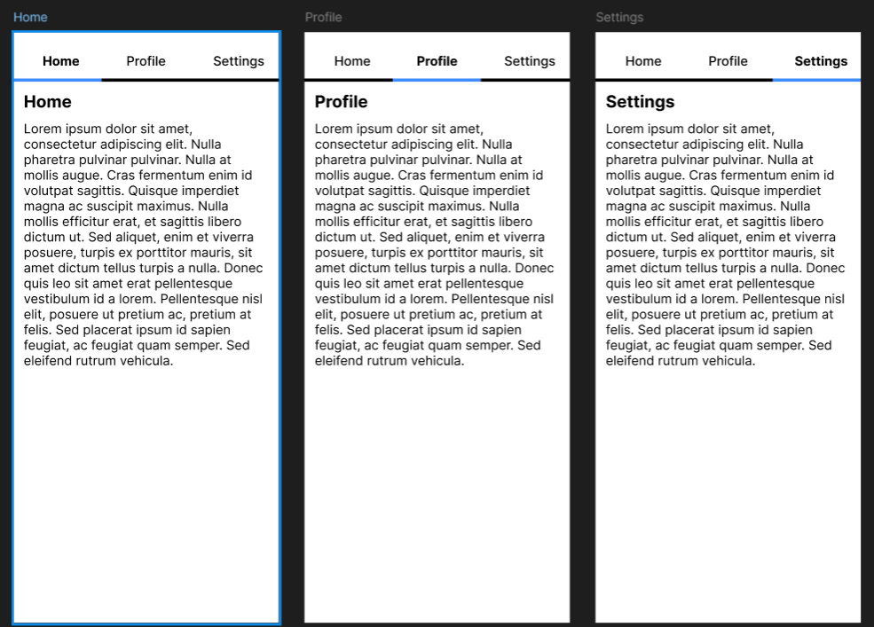
reassuring_pallet
@reassuring_pallet
Segmented Control Page Switcher
Design the top segmented control that switches a mobile screen between two or three peer views. It sits above the page content, not inside it, and acts as the main navigation for this screen.
The control needs a clear active segment with a sliding indicator so the current view is obvious while the user moves between peers. Treat the segments as equals; none should feel secondary or nested.
Show how the full screen content changes under the control when a segment is selected. The transition should feel tied to the control, with the active state staying anchored as the content updates.
This is a navigation pattern, so spacing, hit areas, and label length matter. It should read fast, work one-handed, and still feel stable when labels are short or slightly uneven.
What to deliver
- Design the default state with 2 or 3 segments and one active selection.
- Show the selected, pressed, and disabled states for segments.
- Show the content area below in at least two segment selections.
- Define the indicator movement and selected-state transition.
- Include a long-label case and a short-label case.
Design the indicator to track the selected segment’s width, not just its center, so the switch feels precise when labels vary in length.