Gallery
See what others have created

misaka
@misaka
Grid
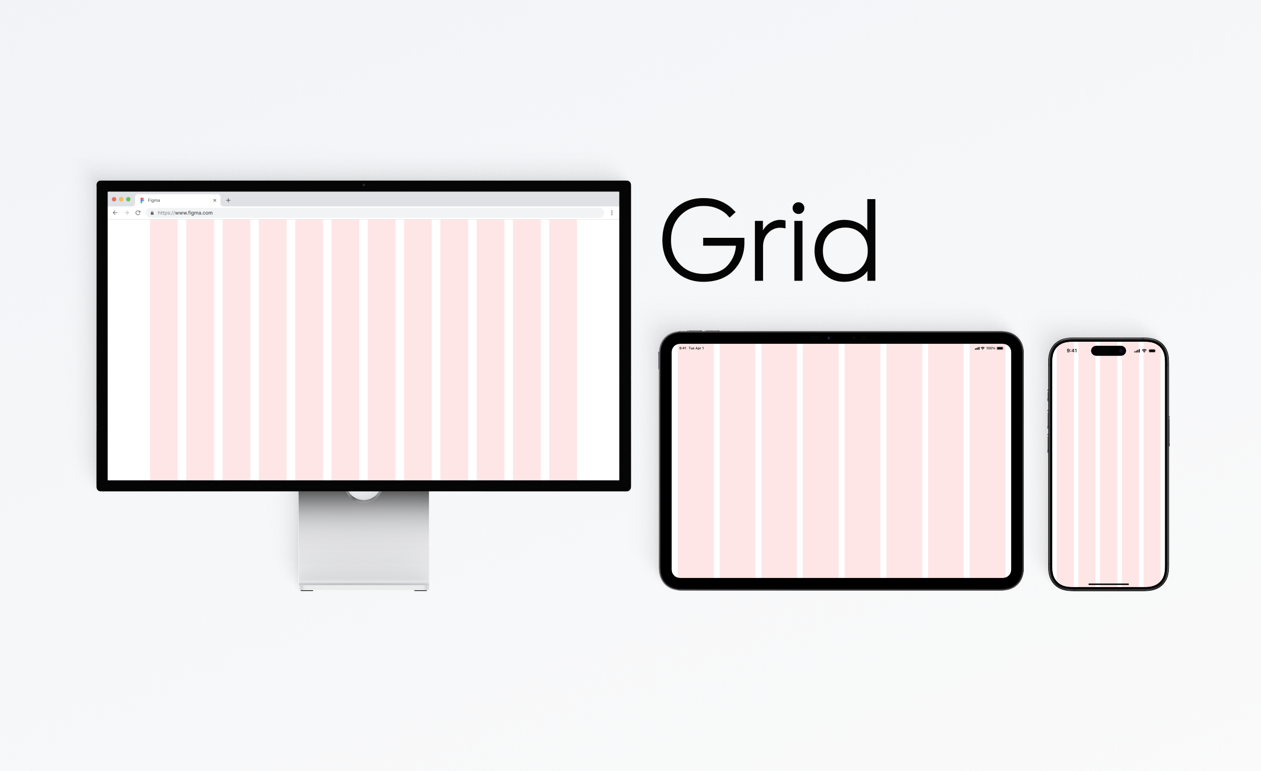
Design a grid component for arranging content cards, data blocks, or media tiles in rows and columns. The grid should make structure visible, not just implied: show the column rhythm, gutters, and outer padding that hold the layout together.
Include at least three content densities so the system can be judged in use: a sparse grid with large cards, a balanced default grid, and a dense grid with many smaller items. Show how items align when they span multiple columns or rows, and how the layout handles uneven content lengths.
The grid should adapt across desktop, tablet, and mobile without breaking hierarchy. On smaller widths, columns should collapse predictably and the reading order should stay clear. Include an empty state and an overflow state so the component shows what happens when there is too little or too much content.
What to deliver
- Design a responsive content grid with visible column structure
- Show at least three item types placed in the grid
- Define spacing, gutters, and outer margins
- Include desktop, tablet, and mobile layouts
- Show empty, dense, and overflow states
Explore using various grid systems like the 12-column grid or the 8pt grid, and see how they impact your design's symmetry and balance.