Gallery
See what others have created
unrecognizable_enamel
@unrecognizable_enamel
Privacy Settings Onboarding
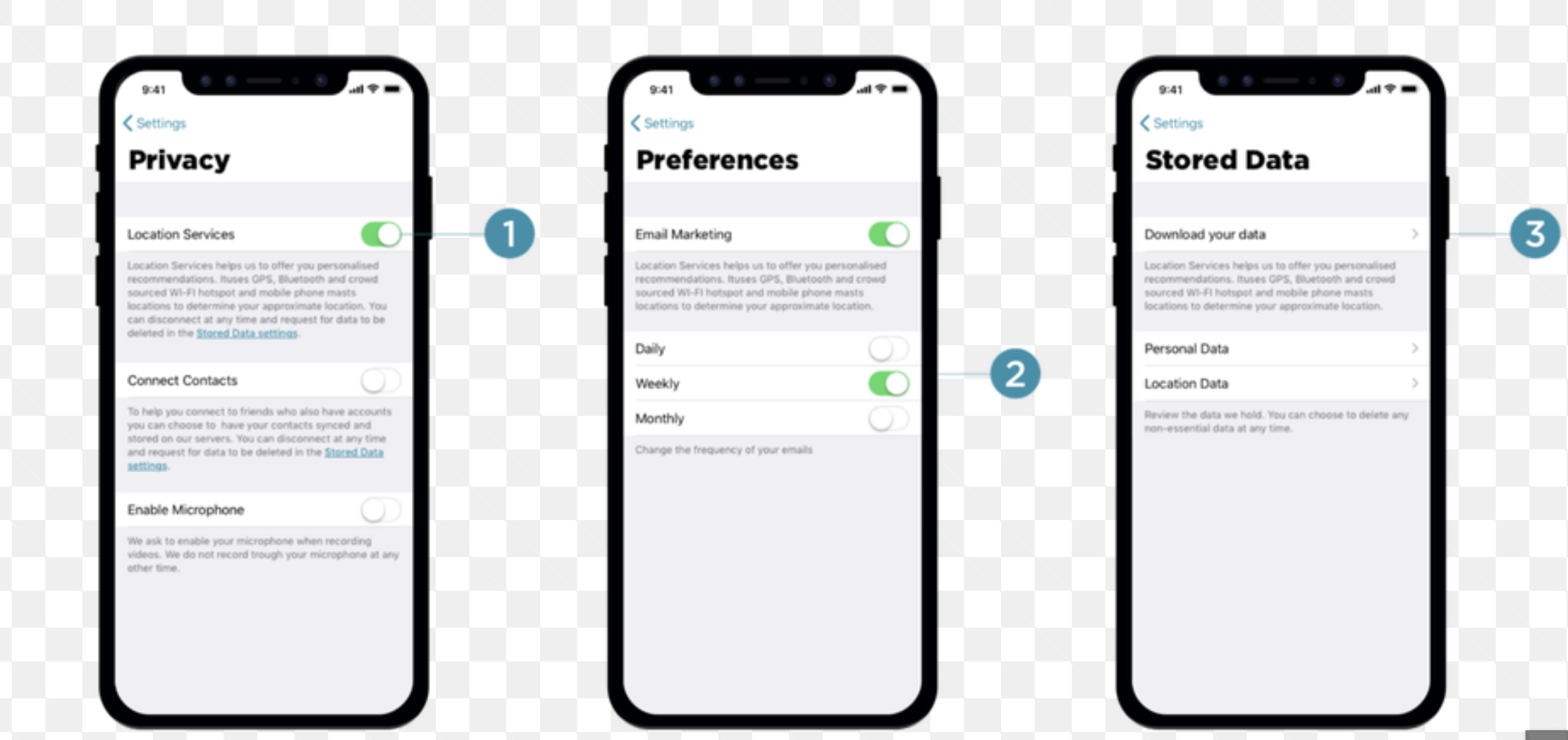
Design the setup screen where a new user chooses what data they share. It sits inside mobile onboarding, so it should feel like part of the flow, not a settings page.
The screen needs to explain each sharing option in plain language: what is collected, why it matters, and what changes if the user turns it off. Keep the copy short enough to scan on a phone.
Treat the choices as a trust moment. Users should understand the tradeoff without opening help, and the layout should make the default state and the consequences of each toggle obvious.
This is still onboarding, so there should be a clear way to continue after making a choice, plus a low-friction path to skip or review later if that fits the product model.
What to deliver
- Design the privacy choices screen in its default state
- Show each data-sharing option with a short explanation and current toggle state
- Include the primary continue action and any secondary skip or learn-more action
- Design the state where a user changes one or more sharing choices before moving on
Group options by intent, not by technical system. Users decide faster when labels say what the data is used for, not where it goes.