Gallery
See what others have created
sheeshable
@sheeshable
Disclosure controls
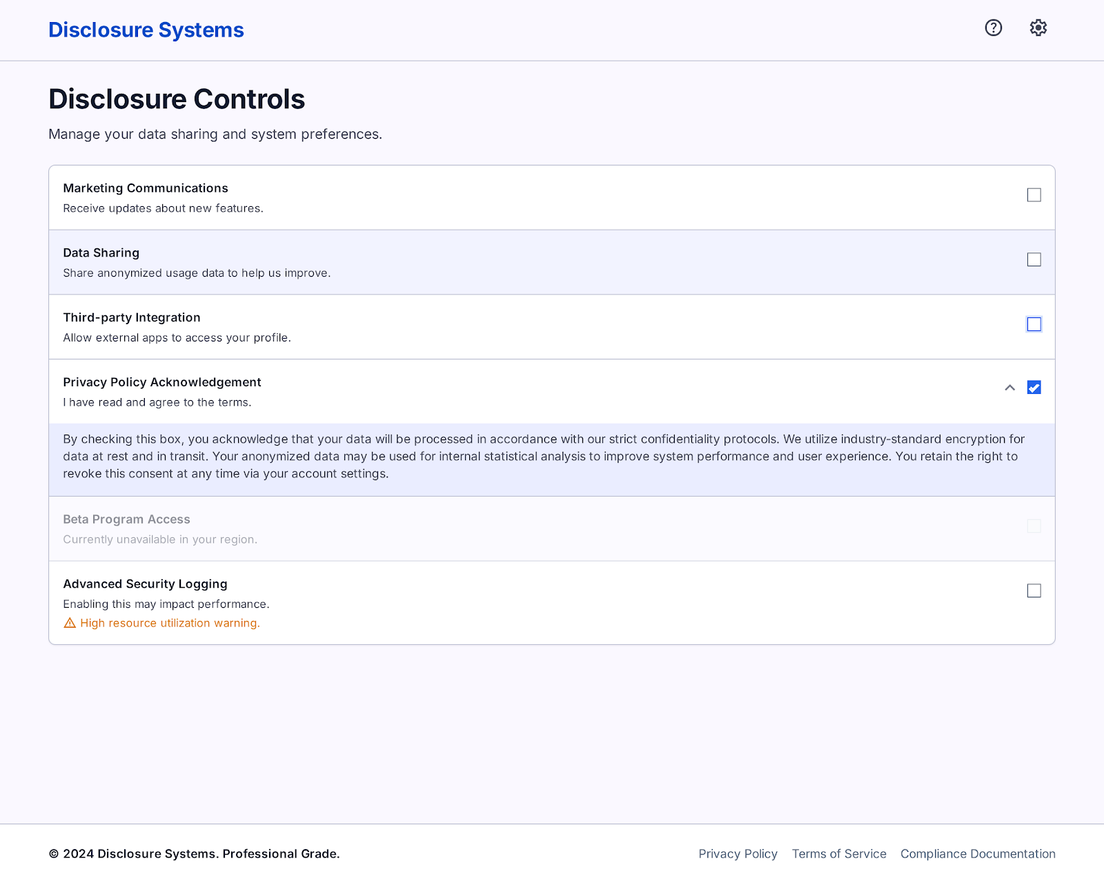
Design a disclosure control pattern for forms where users must reveal, confirm, or specify information before continuing. This is the kind of UI used for privacy notices, compliance acknowledgements, billing disclosures, or optional details hidden behind a checkbox or toggle.
The component should make the main choice obvious first: label, control, and one line of context. If extra explanation is needed, reveal it inline below the control without pushing the user into a separate screen. Keep the hierarchy tight so the user can scan multiple disclosures in a list and understand which ones are required, optional, or already completed.
Show how the control behaves across states: unchecked, checked, disabled, focused, and expanded. If the disclosure includes a warning, make the consequence clear in plain language and keep the next step visible. The interaction should feel calm and direct, with no ambiguity about what the user is agreeing to or what happens when they make a selection.
What to deliver
- Design a disclosure row with label, short helper text, and control.
- Show the control in default, hover, focused, checked/on, and disabled states.
- Include a secondary detail area that expands only when the disclosure needs explanation.
- Add inline validation or warning text for incomplete or risky selections.
- Provide a compact mobile version with the same hierarchy and tap targets.
Infuse your design with subtle animations or highlights to guide attention to the most critical elements, fostering an intuitive user journey.