Gallery
See what others have created
sheeshable
@sheeshable
Blanket or Full-Screen Overlay
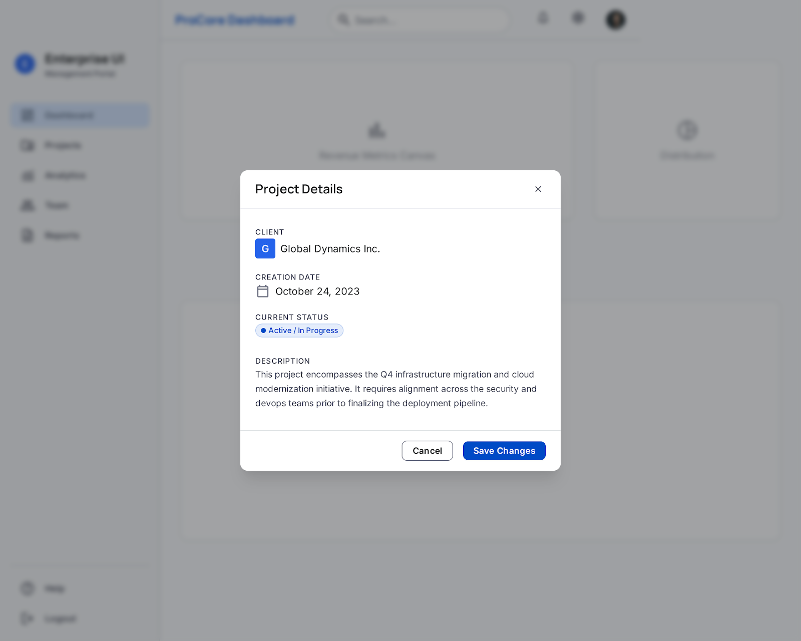
Design a blanket overlay and a full-screen overlay for a product UI. The blanket version should dim the page and keep the task in context; the full-screen version should take over when the content needs more room or stronger focus. Make the difference between the two obvious in layout, scale, and background treatment. Each overlay should include a clear header, body area, and a visible dismiss control. If the overlay contains a form, confirmation, or media, keep the primary action dominant and place secondary actions where they do not compete. Background content should be visually suppressed and not feel interactive while the overlay is open. Design for common overlay states: opening, active, loading, and error. If content fails, keep the user’s entered context and offer a direct recovery path. The layout should work at desktop and mobile sizes without clipping content or hiding the close action. Treat this as a reusable component spec, not a one-off screen. Define the rules that decide when to use blanket versus full-screen, how content scrolls, and how dismissal behaves with long content.
What to deliver
- Design the overlay container in both blanket and full-screen variants
- Include header, body content, and a clear close action
- Show one primary action and any secondary actions
- Define spacing, scrim, and content width rules
- Ship loading, empty, and error states for overlay content
Spice up your overlay with subtle animations to draw attention without distracting. Consider fade-ins or smooth transitions to make the appearance of the overlay feel natural and less intrusive.