Gallery
See what others have created
sheeshable
@sheeshable
Badge & Status Dot
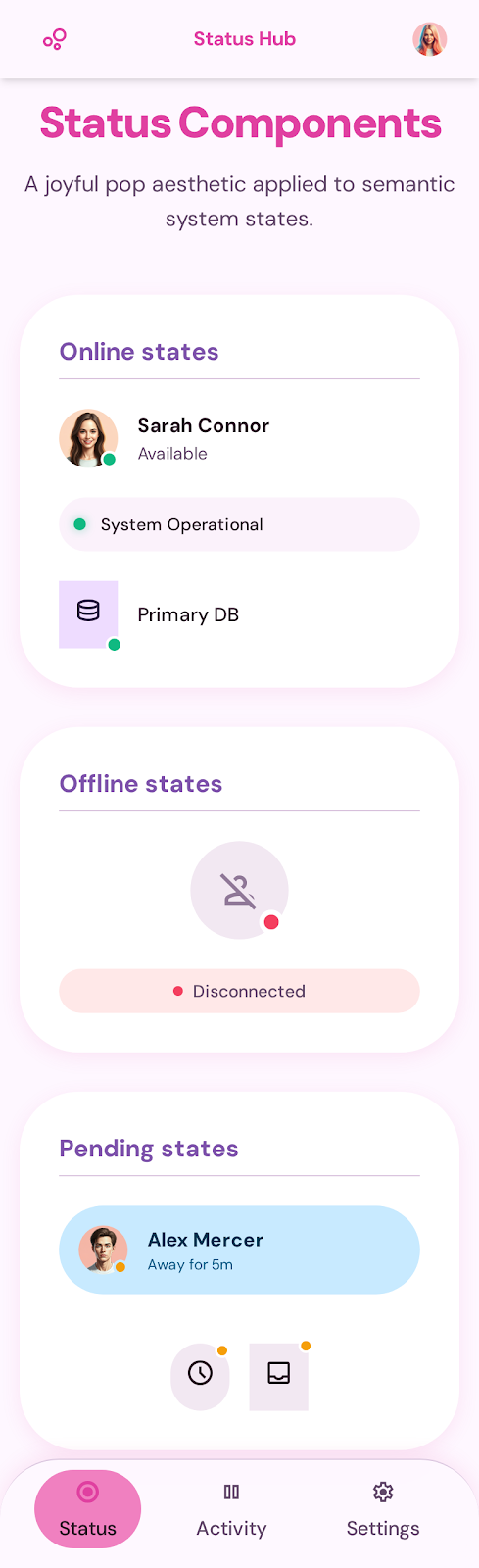
Design a badge component with a status dot that can sit on top of or beside an icon. The badge should work at small sizes, where the dot carries the meaning quickly and the icon still stays recognizable.
Create three clear presence states: online, busy, and offline. Use one visual system for all three, with fixed rules for dot size, color, and spacing. Show the dot in at least two placements: tucked into a corner of the badge and aligned just outside it as a companion marker.
The component should be usable in a social profile, messaging list, or task assignment surface without changing its core structure. Keep the badge readable on light and dark backgrounds, and define what happens when the status is unknown or color alone is not enough to communicate it.
What to deliver
- Design a badge icon with a status dot in 3 states: online, busy, offline
- Show the dot in at least 2 placements: corner overlay and adjacent label
- Define size, color, and spacing rules for small and large badge use
- Include a compact legend or tooltip pattern for ambiguous statuses
Make your status dot design dynamic. Experiment with animation or pulse effects for a more interactive user experience, grabbing attention without overwhelming.