Gallery
See what others have created
sheeshable
@sheeshable
Inline edit
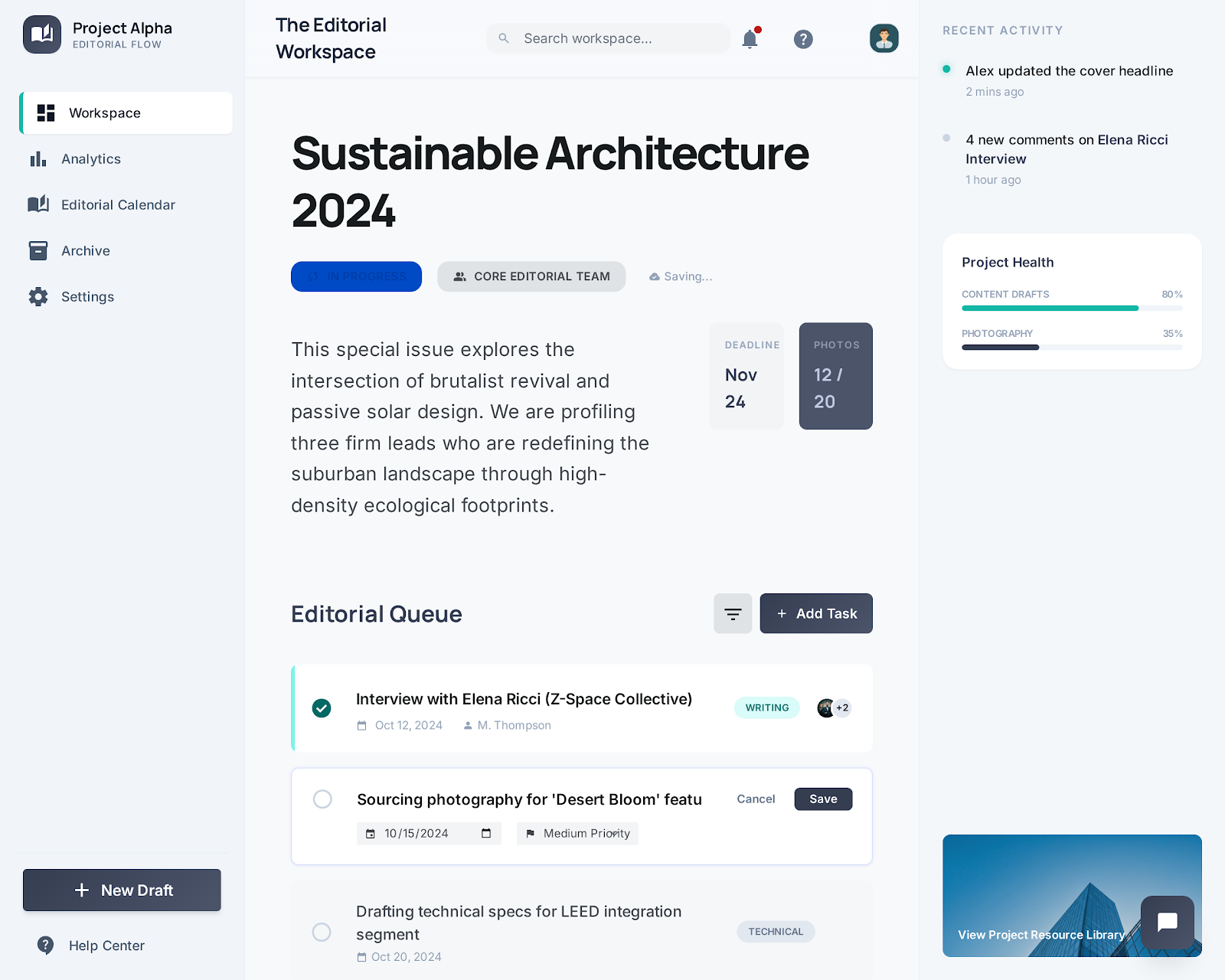
Design a single inline edit pattern for a content field that starts in read mode and switches to edit mode in place. Pick one realistic use case, such as a title, label, date, or short text field, and show how the component behaves in a normal product screen.
The interaction should cover how a user enters edit mode, what happens while typing, and how the change is committed or canceled. Keep the surrounding layout steady so the edit feels local, not like a page transition. The control should read as editable before interaction, then as a form field once active.
Show the full state set: default, focused, editing, saved, empty, validation error, and failed save. Make the recovery path obvious when something goes wrong, and keep the user’s entered value visible in error states. Include keyboard behavior and focus handling so the pattern works with tab, enter, escape, and blur.
What to deliver
- Design the read state, edit state, and saved state for one inline field.
- Include a clear trigger to enter edit mode and a clear way to commit or cancel.
- Show validation for empty, invalid, and failed-save cases.
- Keep surrounding content stable while the field changes size or focus.
- Add keyboard and focus behavior for tab, enter, escape, and blur.
Incorporate visual cues like borders or background color changes to signal editable areas, ensuring users are never confused about where they can click to edit information.