Gallery
See what others have created
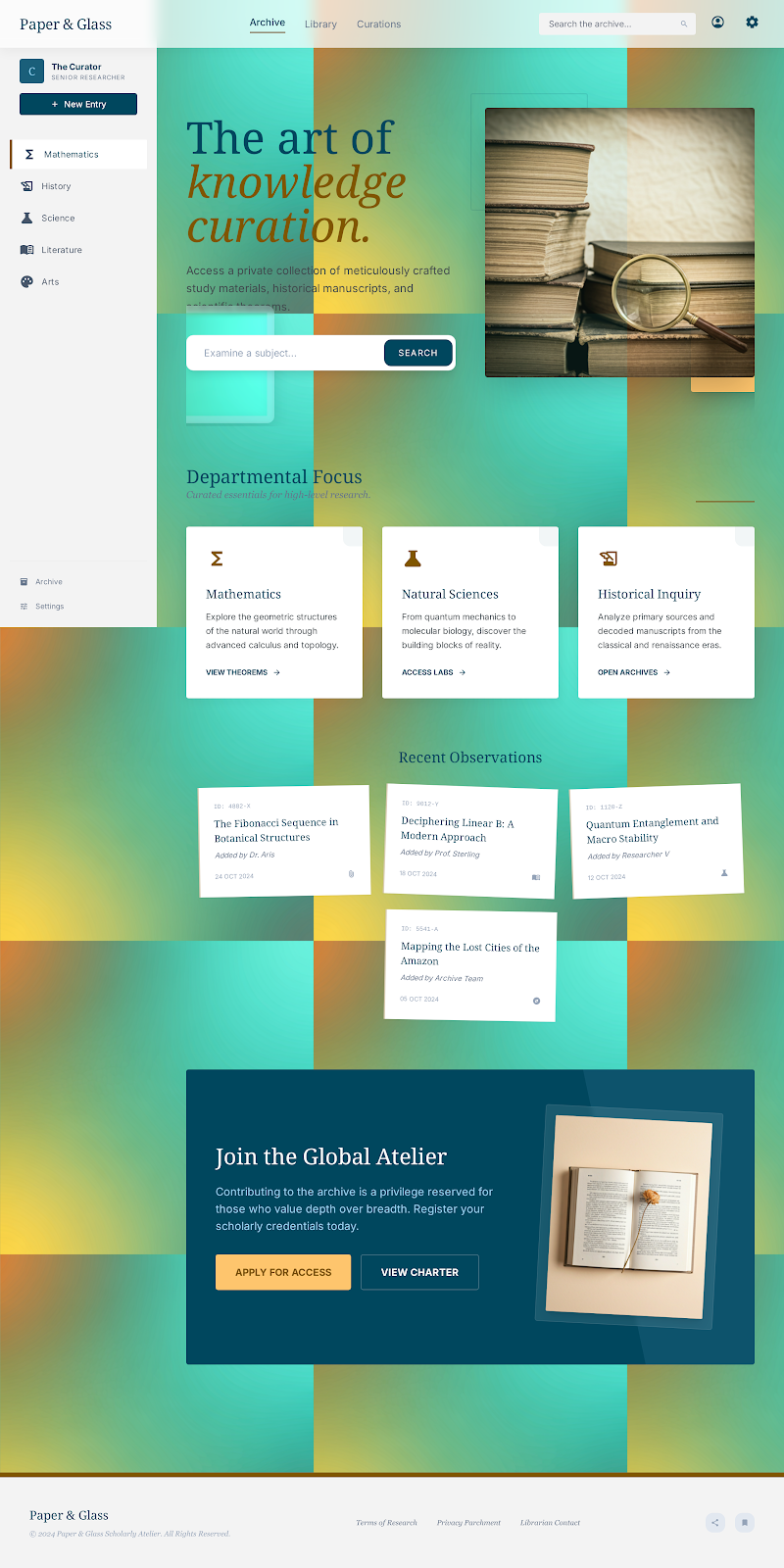
sheeshable
@sheeshable
Materials
Design a materials reference screen for a UI system. The goal is to show how the product uses surface treatments, not to create a decorative collage. Pick 3–5 material styles — for example matte, glass, metal, paper, or soft plastic — and show them as clear, side-by-side samples.
Each sample should include the surface itself, a label, and a few concrete properties: texture, opacity, reflectivity, and depth. Show how the material behaves in at least one state change, such as hover, press, focus, or disabled. If the material uses blur, sheen, grain, or shadow, make sure the effect supports the surface rather than overpowering it.
Keep the layout practical. Use enough contrast that text remains readable over every material. Show where the material would appear in the product, such as cards, panels, buttons, or overlays, so the viewer understands intent and not just appearance.
The final screen should feel like a system sample, not an art piece. A teammate should be able to look at it and know which surface to use, what it communicates, and how it behaves in the interface.
What to deliver
- Design a single screen that demonstrates 3–5 distinct material treatments
- Show each material as a reusable component token or surface sample
- Include labels for texture, opacity, elevation, and finish
- Demonstrate one interaction state for each material, such as hover or pressed
- Add a short note on where each material should and should not be used
Incorporating principles from Material Design can be quite insightful. Look at how light and shadow are used to create depth and suggest tactile interactions, making the digital feel more tangible.