Gallery
See what others have created
hatefulskirmish
@hatefulskirmish
Accessibility
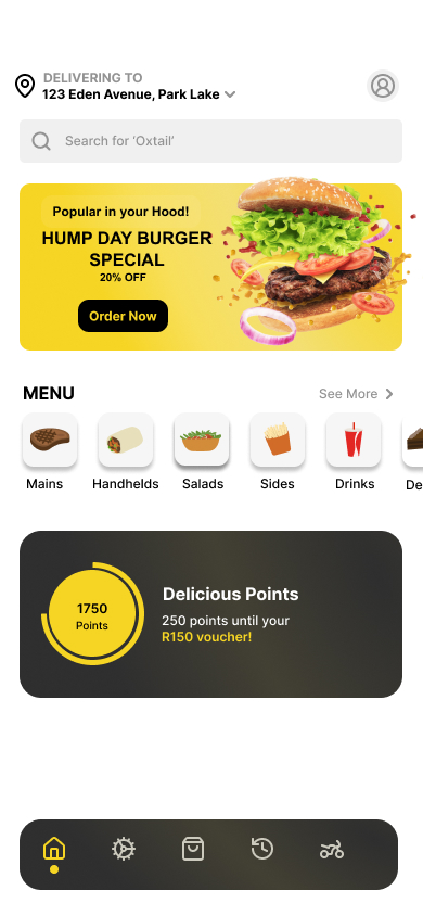
Design one hi-fi web screen that can be used with keyboard, screen reader, and low-vision settings. Pick a common product surface, such as a form, settings page, or content editor, and make accessibility part of the layout rather than an afterthought.
Show the full interaction set: default, hover, focus, error, and disabled states. Focus styling should be visible without depending on color alone, and the tab order should feel logical from top to bottom. If the screen includes a form, errors should sit next to the field they belong to and explain how to fix the problem.
Include the supporting content the interface needs to work: labels, helper text, alt text for images, and captions for media. Keep contrast strong, type sizes readable, and touch targets easy to hit. The design should still make sense if colors are removed or if the user is navigating with a screen reader.
Treat this as a real production screen, not an accessibility checklist. The result should show how inclusive design changes hierarchy, spacing, and interaction details across the whole page.
What to deliver
- Design a hi-fi screen with accessible color contrast and readable type
- Show keyboard focus states for every interactive element
- Add alt text, captions, and labels where content needs them
- Include one form or control pattern with clear error and helper text
- Show how the layout works without relying on color alone
Accessibility can be a canvas for innovation. Designing for a diverse set of users often leads to creative solutions that improve the experience for everyone!